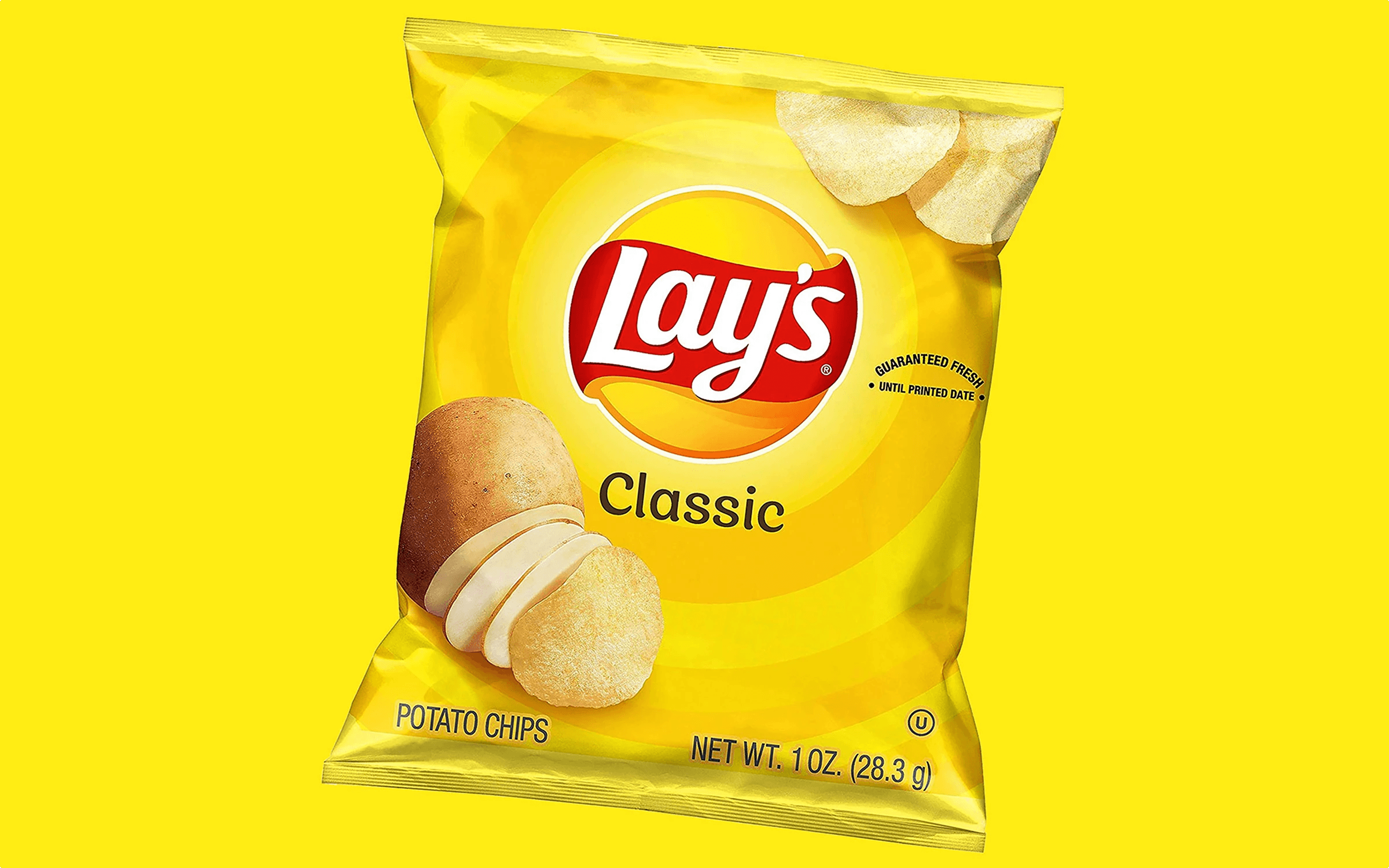
Lay’s Flavours
The font for the world's famous crisps
Client
PepciCo Inc.
Sector
Food Industry
Credits
Denis Serebryakov
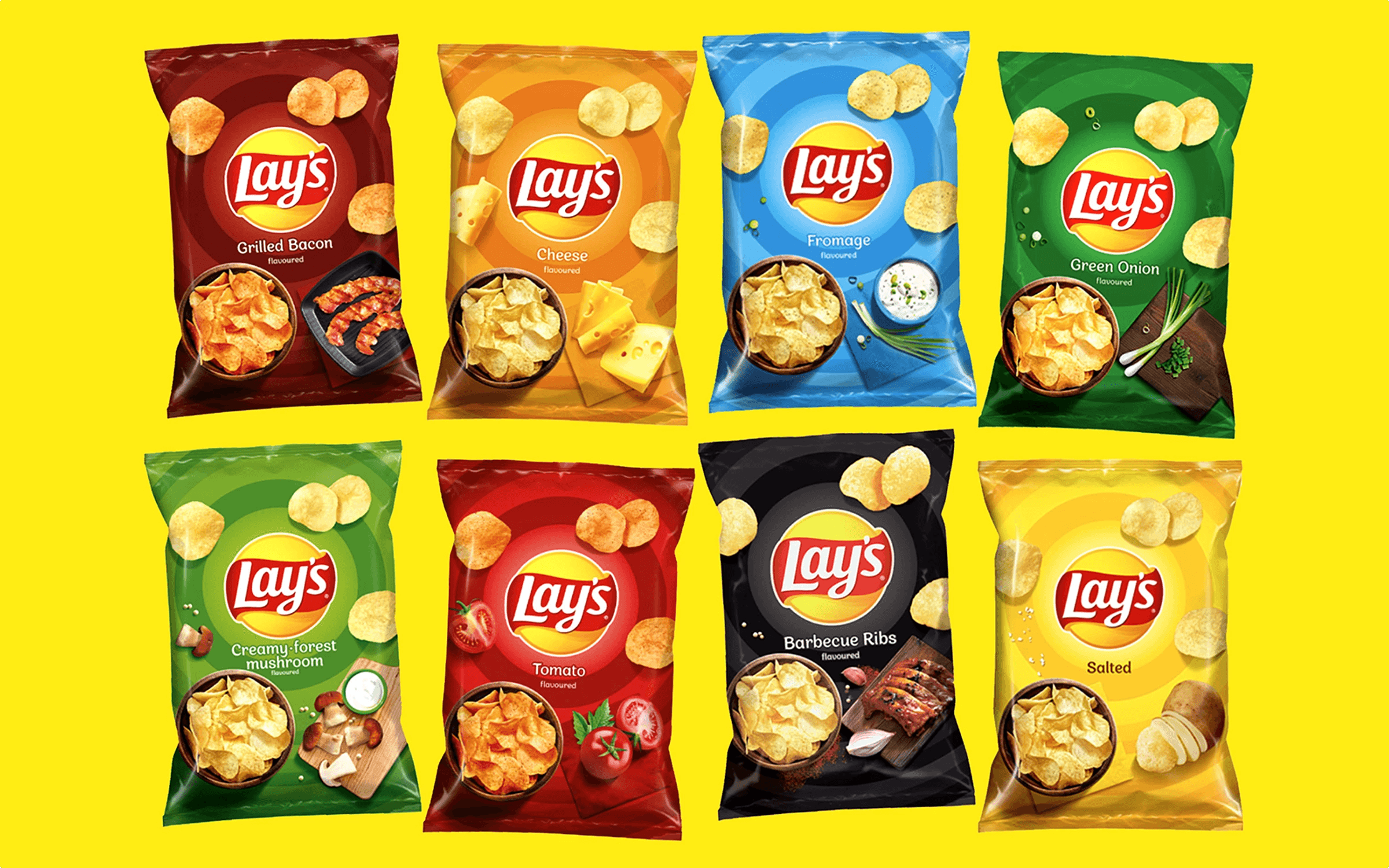
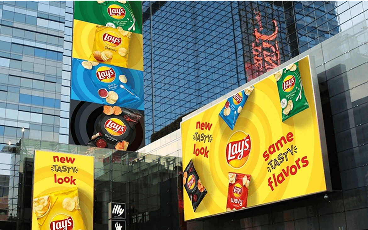
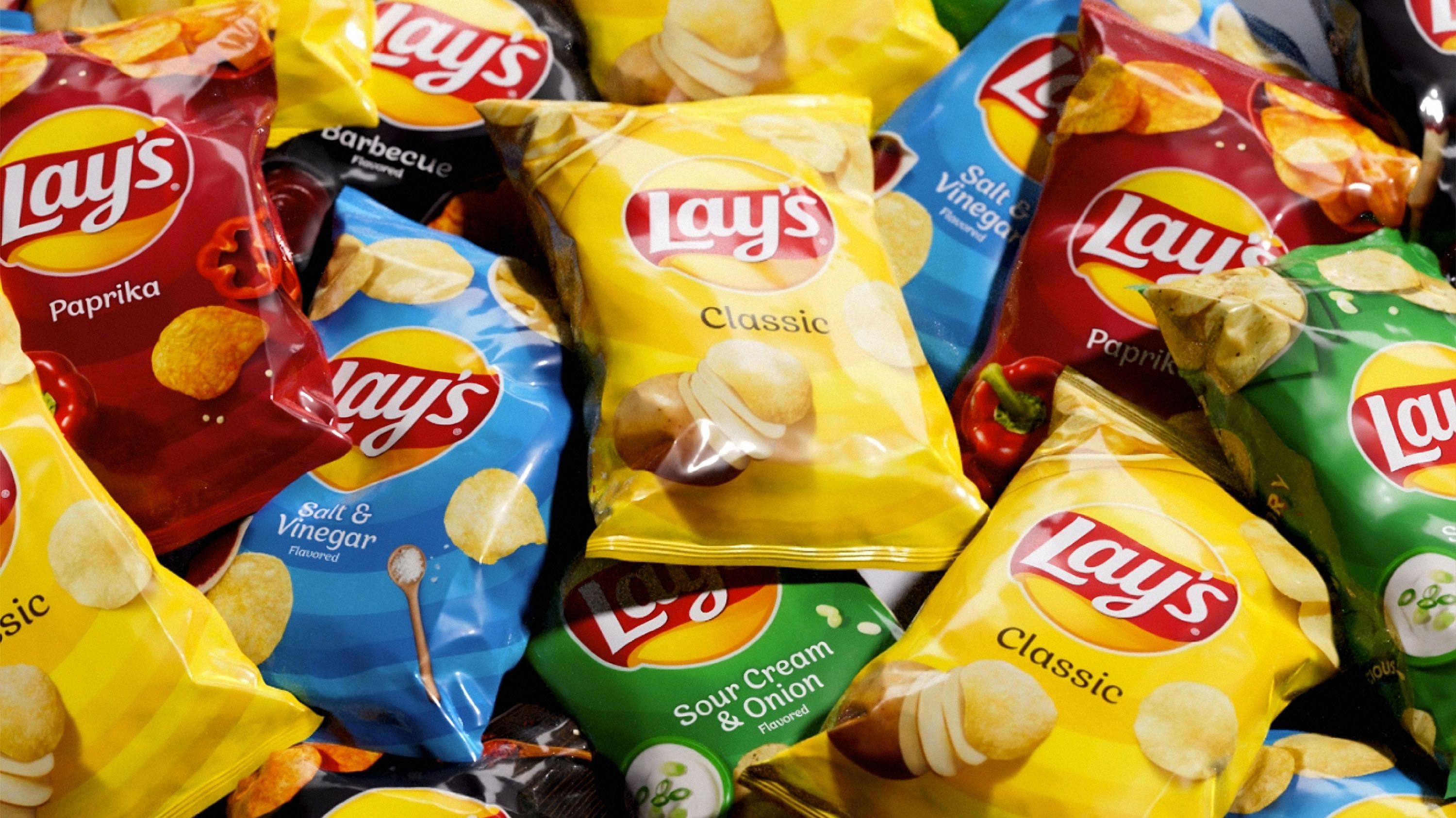
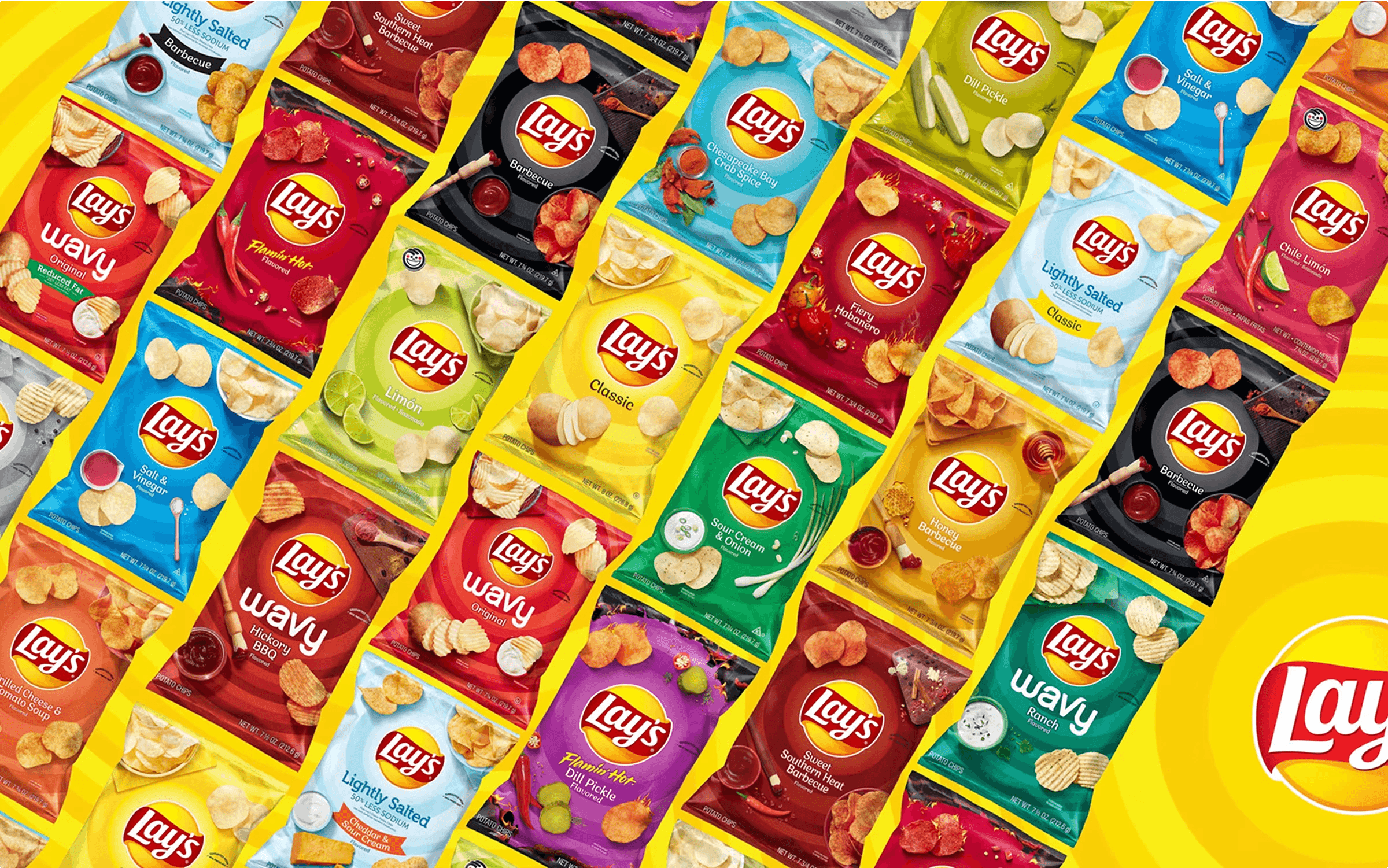
The modification of the Appetite Pro font was made at the request of PepsiCo as part of a major Lay’s rebranding — the brand’s first in 12 years. Appetite Pro was chosen due to its visual similarity to the brand's logo and its balanced combination of expressiveness and neutrality, essential for a mass-market product.
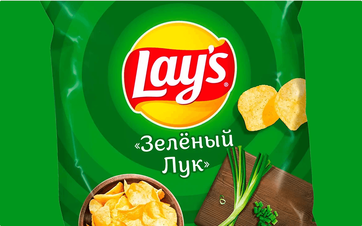
Based on sketches provided by PepsiCo’s design department, subtle changes were made to several dozen letters, creating an exclusive version of the font perfectly suited for labeling chip flavors on updated packaging worldwide, whether in Latin, Cyrillic, or Greek alphabets.
Appetite Lay’s was released in four styles — Light, Regular, Italic, and Medium — offering designers flexibility in branding various packaging formats and related materials while maintaining a cohesive visual identity.
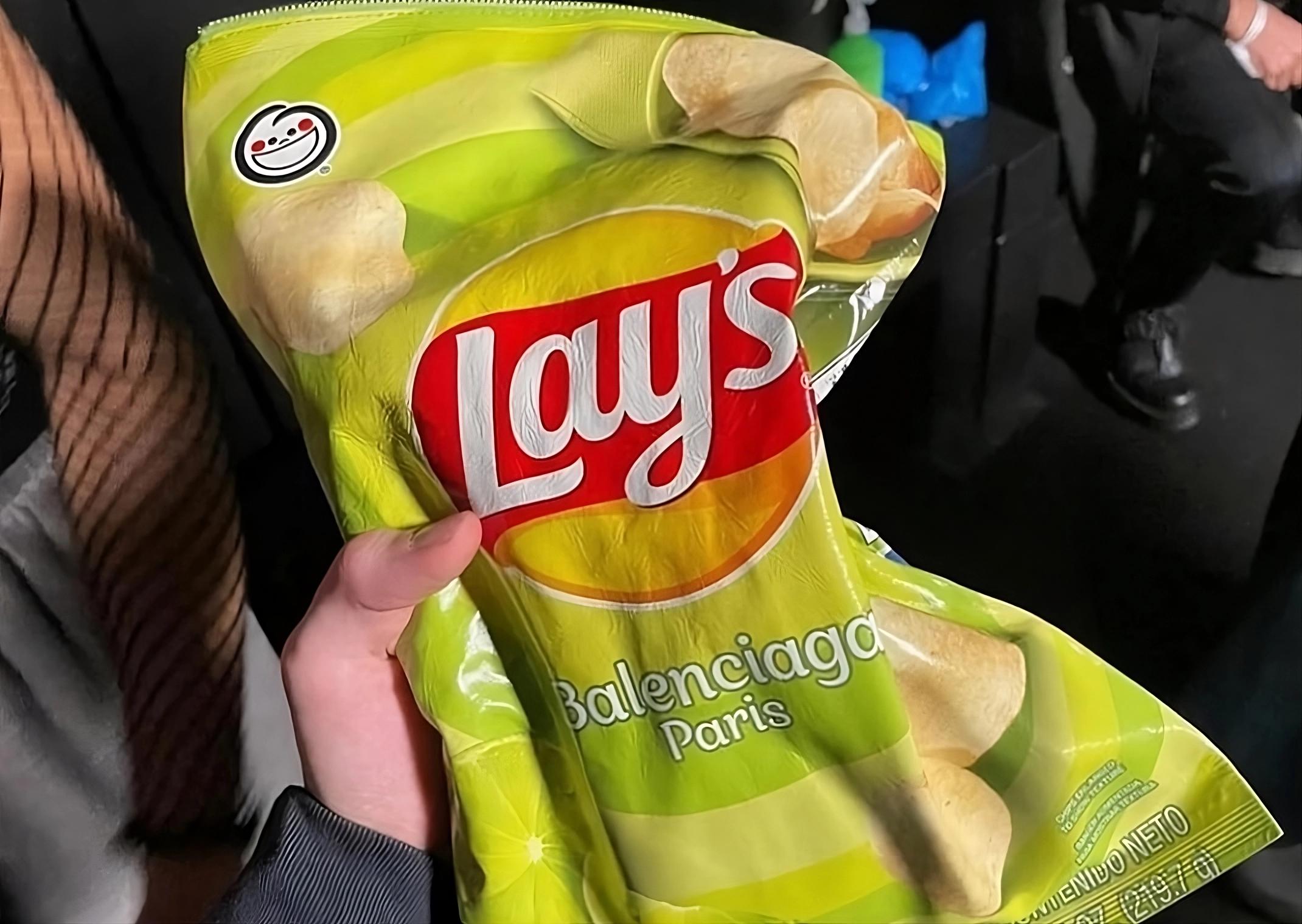
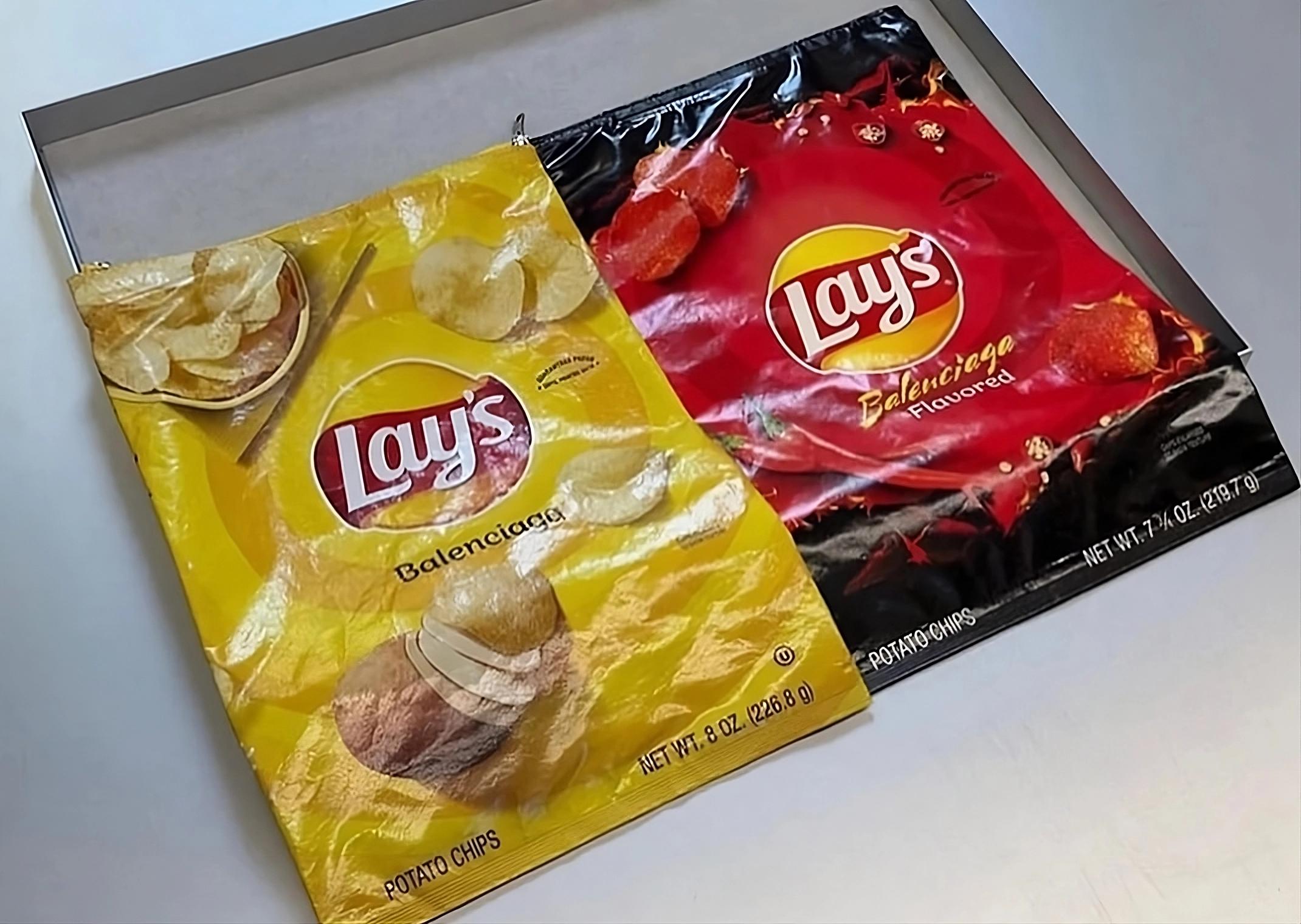
An unexpected continuation of Appetite Lay’s story occurred in 2023 through a collaboration between Lay’s and the fashion house Balenciaga. Balenciaga released collectible bags styled after Lay’s chip packaging, where the Balenciaga logo was typeset using the Appetite Lay’s font instead of the chip flavor. This project merged the worlds of mass-market products and high fashion, highlighting the cultural significance of the font.
The project exemplifies the custom adaptation of previously released fonts to meet specific international client requirements, demonstrating the growing global demand for such services.