Legends of Miensk
A typeface for a limited-edition beer series
Client
Krinitsa Brewing Company
Sector
Food Industry
Credits
Denis Serebryakov (concept, design, typeface)
Andrei Yaroshevich (illustrator)
Vlad Saveliev (copyrighter)
Sources
TheDieline.com
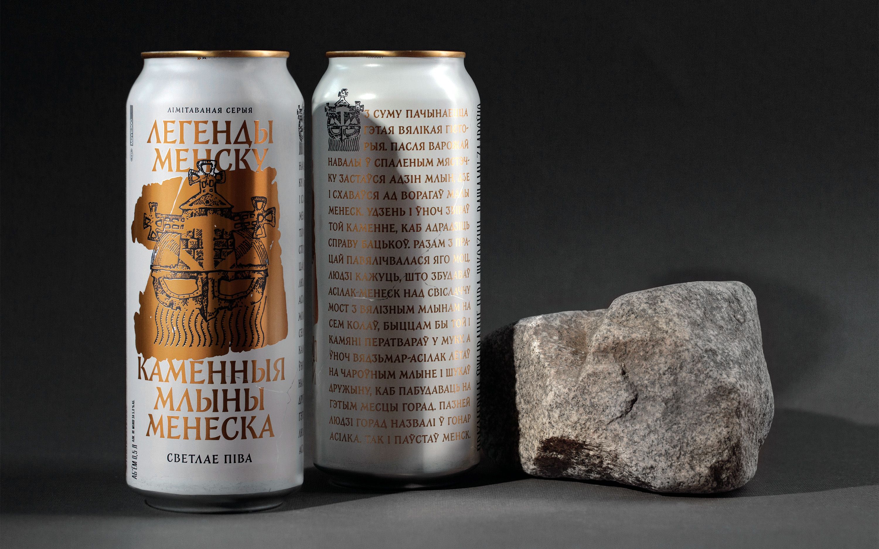
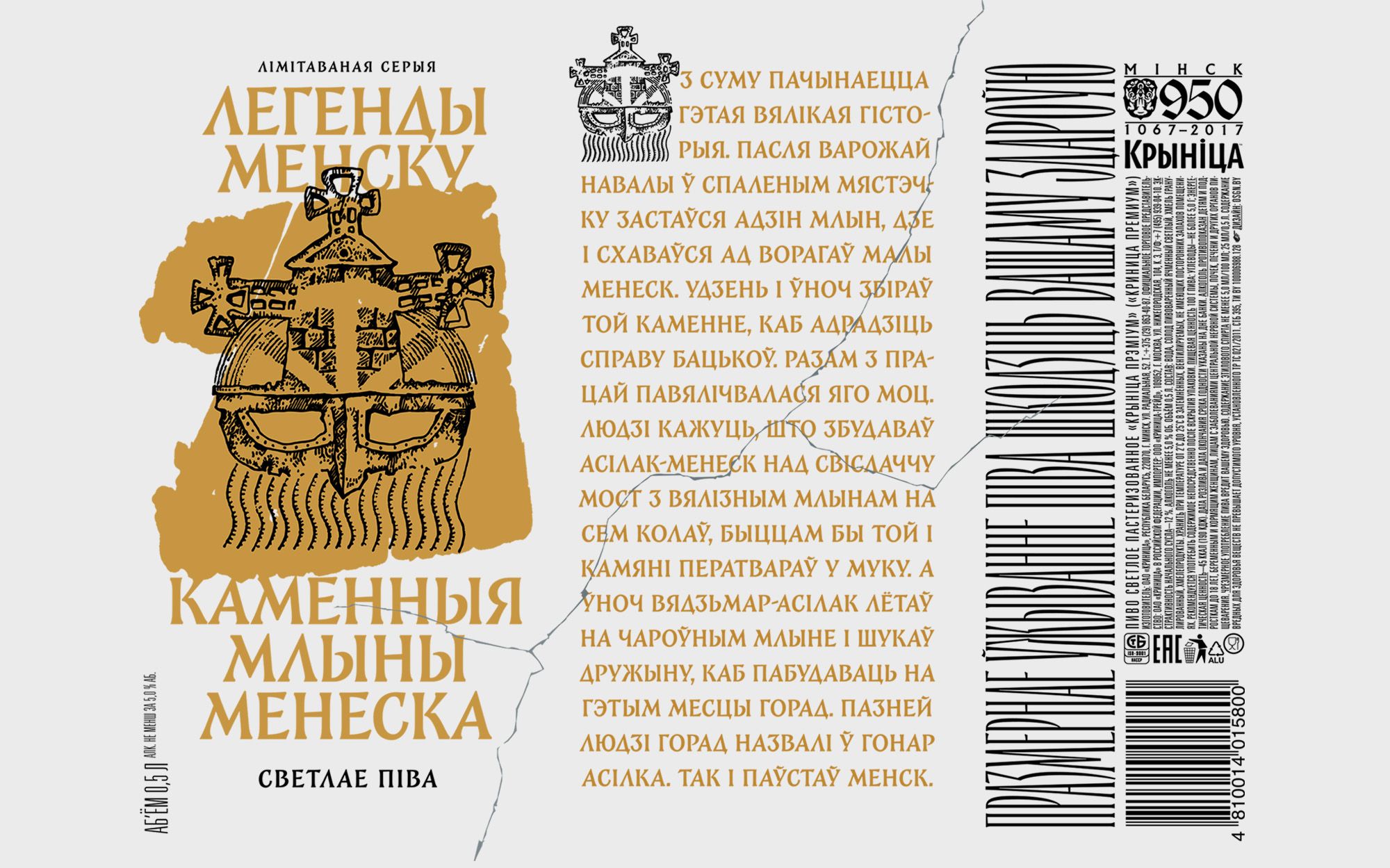
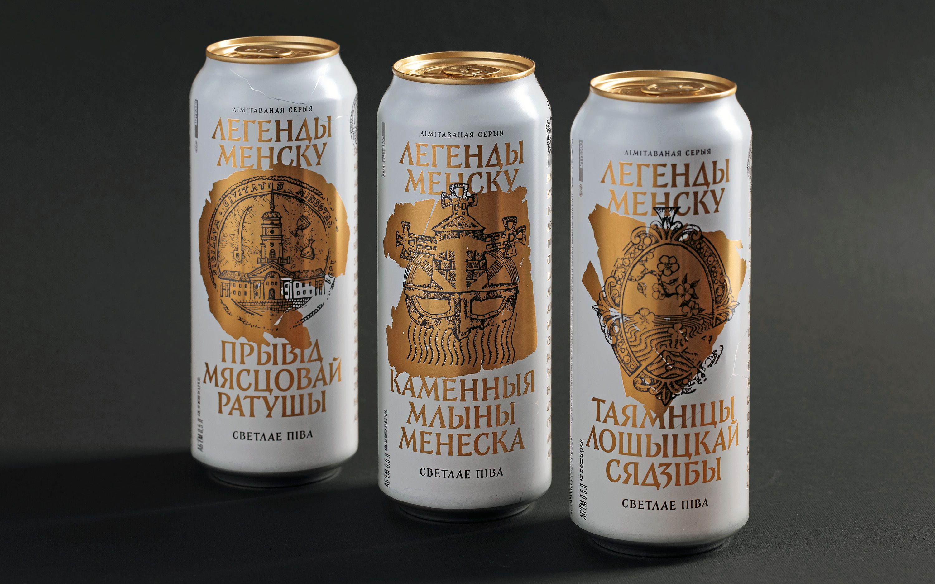
Legends of Miensk is a limited-edition beer line consisting of three packages, each dedicated to a unique urban legend of Minsk: "The Stone Mills of Menesk" (about the city's origin), "The Ghost of the City Hall" (about a local ghost), and "The Secrets of Loshytsa Manor" (a story of tragic love). The project was fully implemented as a comprehensive solution, encompassing the development of the concept, selection of legends, and their visual presentation.
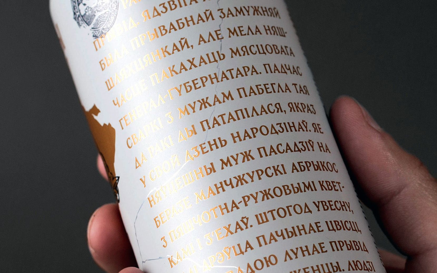
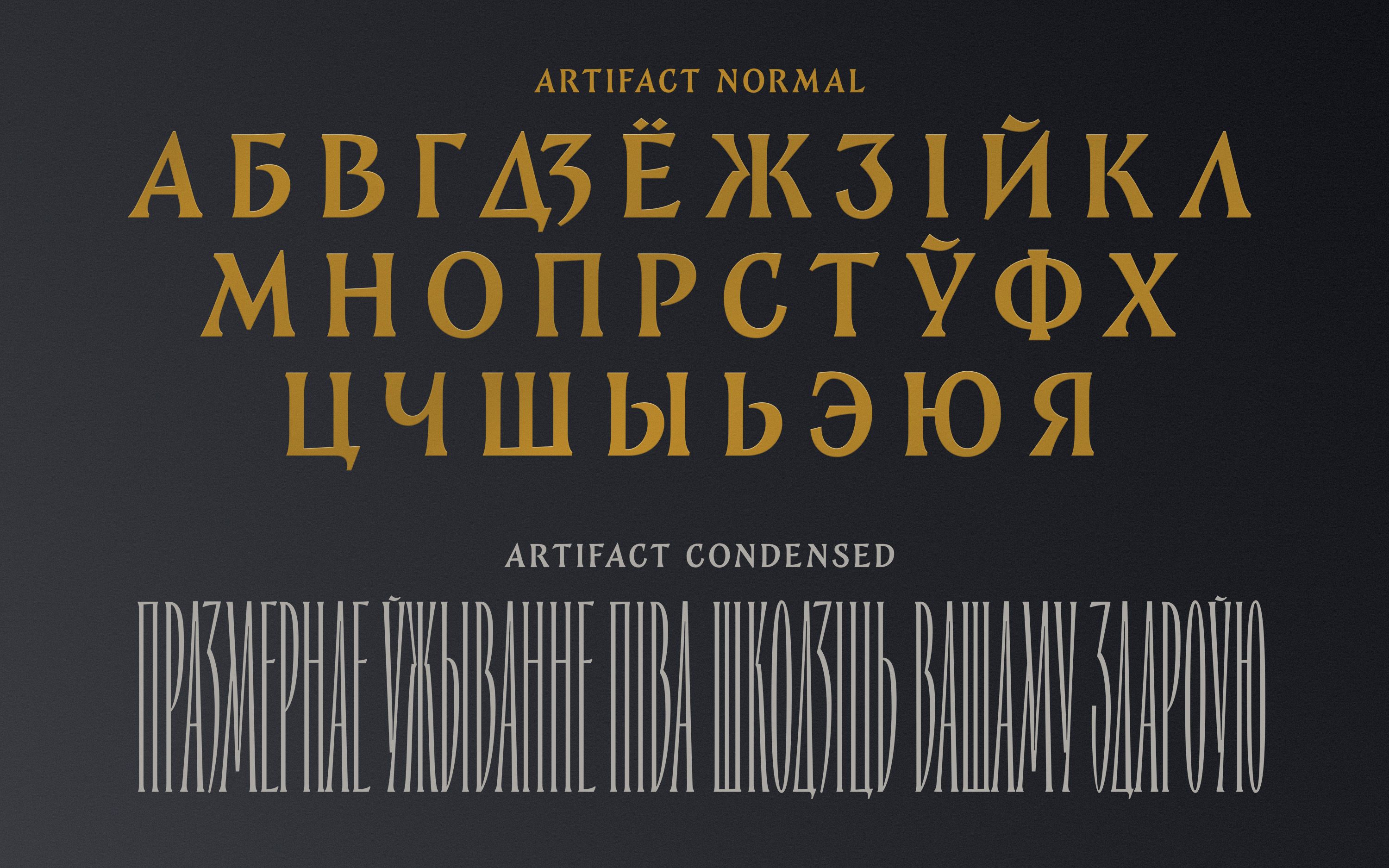
A custom typeface was specifically developed for this project, combining the aesthetics of classical monumental inscriptions (in the spirit of Rome’s Trajan’s Column) with local elements reminiscent of historic Belarusian engravings and antique city seals. This fusion highlights the idea of legends as stories retold multiple times, where historical facts merge with fiction, taking on new forms.
The typeface was initially conceived as the central branding element for the entire series, and its development continued throughout the layout process. Adjustments were constantly made to ensure the text fit evenly and consistently within the designated spaces on each of the three packages.
A particular challenge was the mandatory warning text "Excessive beer consumption is harmful to your health," which had strict government-imposed height requirements for the letters. To address this, an additional ultra-condensed version of the typeface was specifically designed, transforming regulatory constraints into a distinct design feature.
An important reference point in the development of the typeface and graphic style was the barely visible imprint on an old copper coin that was once in local circulation. This influenced the shape of the serifs and the overall plasticity of the letters, while also guiding the stylistic approach to the illustrations and composition. The interconnection of all design elements — typography, graphics, and texture — allowed the packaging to become a complete artifact, both visually and tactilely evoking the feeling of a historical object. As a result, the packaging became more than just a design — it turned into a tangible relic, a collectible item that bridges myth and branding.
The project serves as an example of custom type design, demonstrating how a bespoke typeface can go beyond solving a specific design task to form an entire visual brand platform, seamlessly integrating text, graphics, and form into a unified design concept.