Displace Serif

Family
7 styles
1 variable
Scripts
Latin, Cyrillic
Features
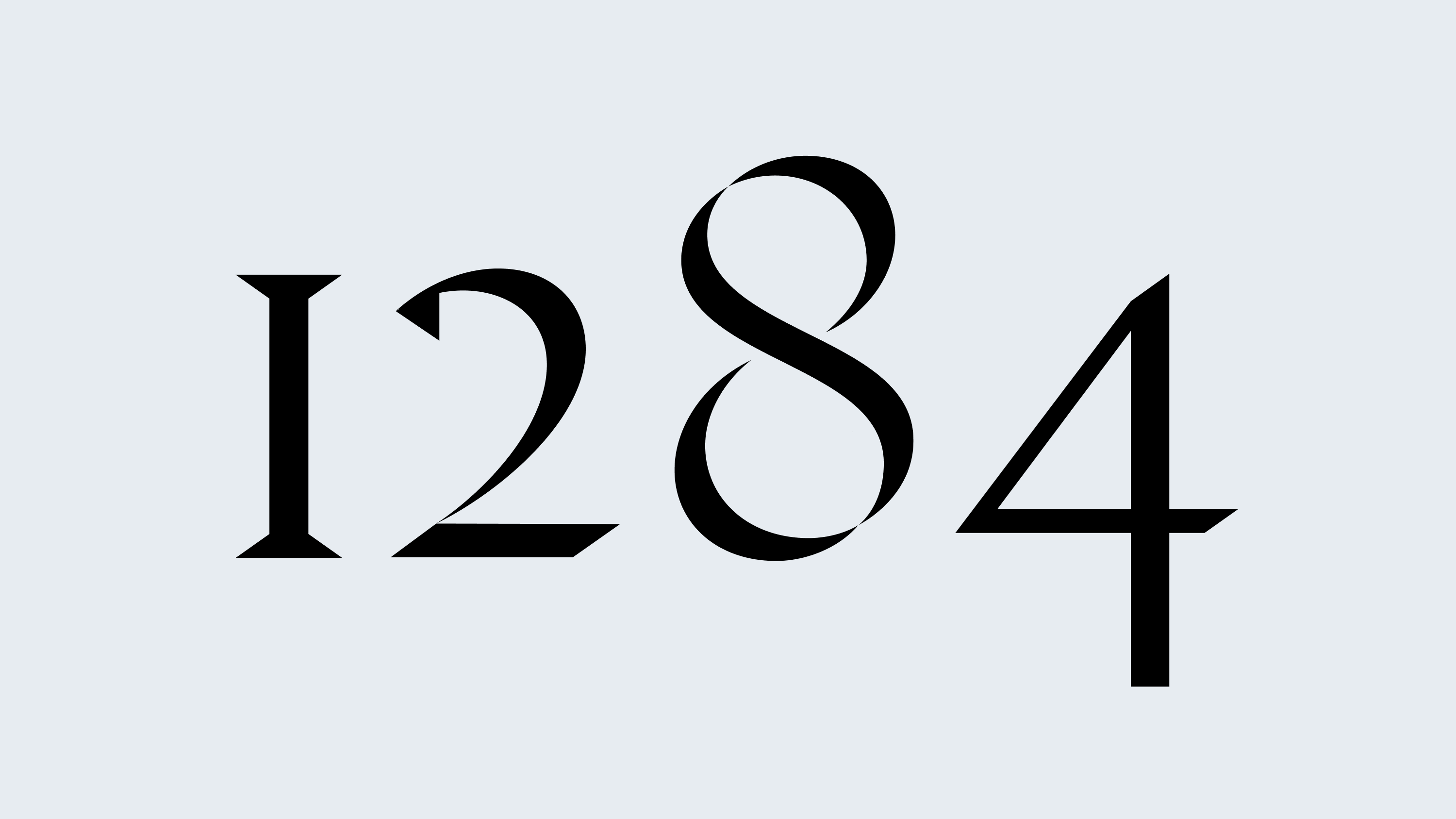
Oldstyle/Lining Figures
Designer
Denis Serebryakov
Release
Jun 29, 2019
Displace Serif is an evolution of the Displace type family, reinterpreted through the logic of a Roman serif. It’s not just a matter of adding serifs — it’s a shift into a different layer of form.
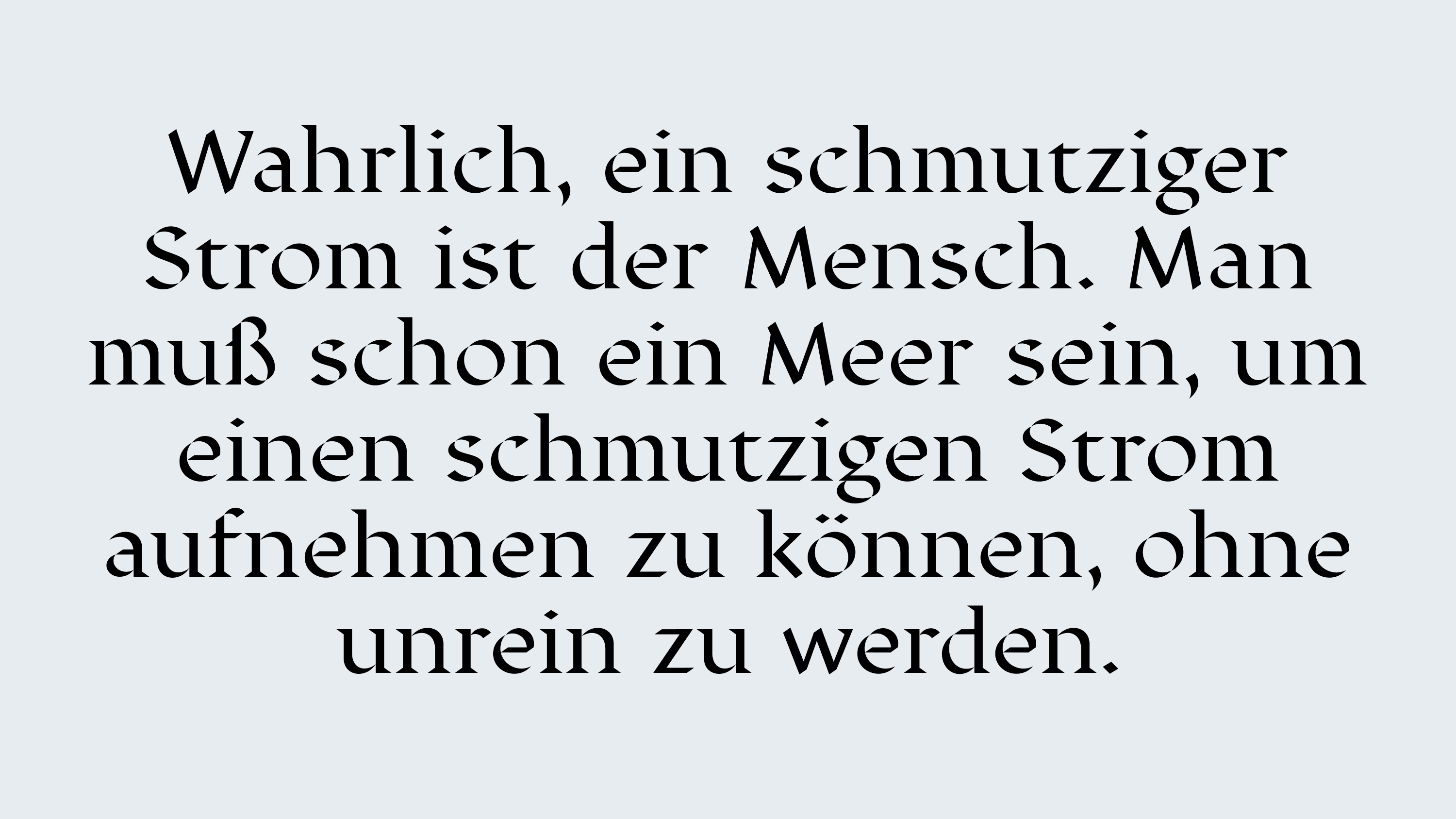
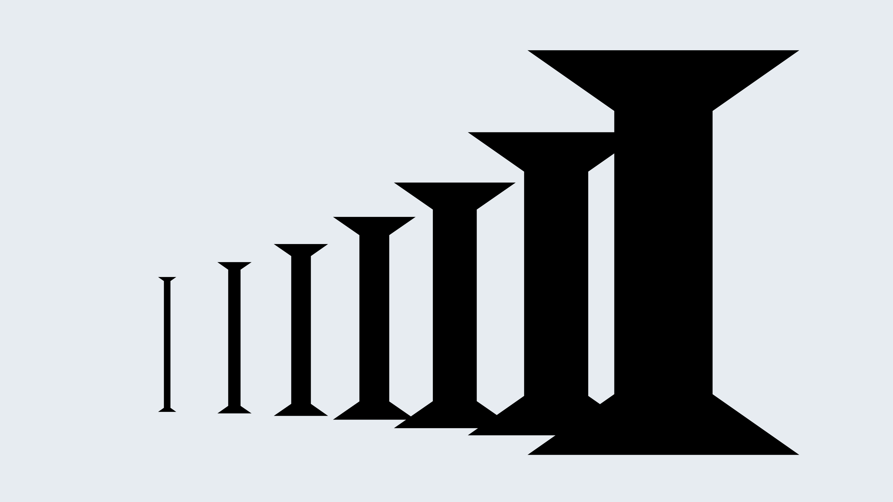
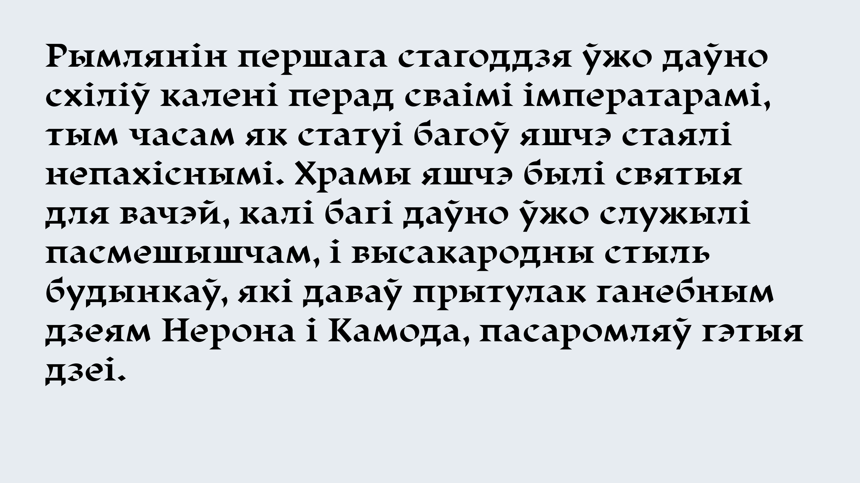
This is a serif with flaws, where the flaws are not weaknesses but an aesthetic; not chaos, but structural deformation. The typeface includes seven upright weights of varying density, which directly influence the character of the serifs — from barely suggested to prominent structural features. In many places, the serifs are absent altogether.
Overall, Displace Serif is not what you’d expect from a serif typeface — though its internal logic still follows the movements of a broad-nib pen. It operates in a state of sustained tension between classicism and disruption — a precise, deliberate intervention into the canon.