Displace 2.0
Family
10 styles (5 italic)
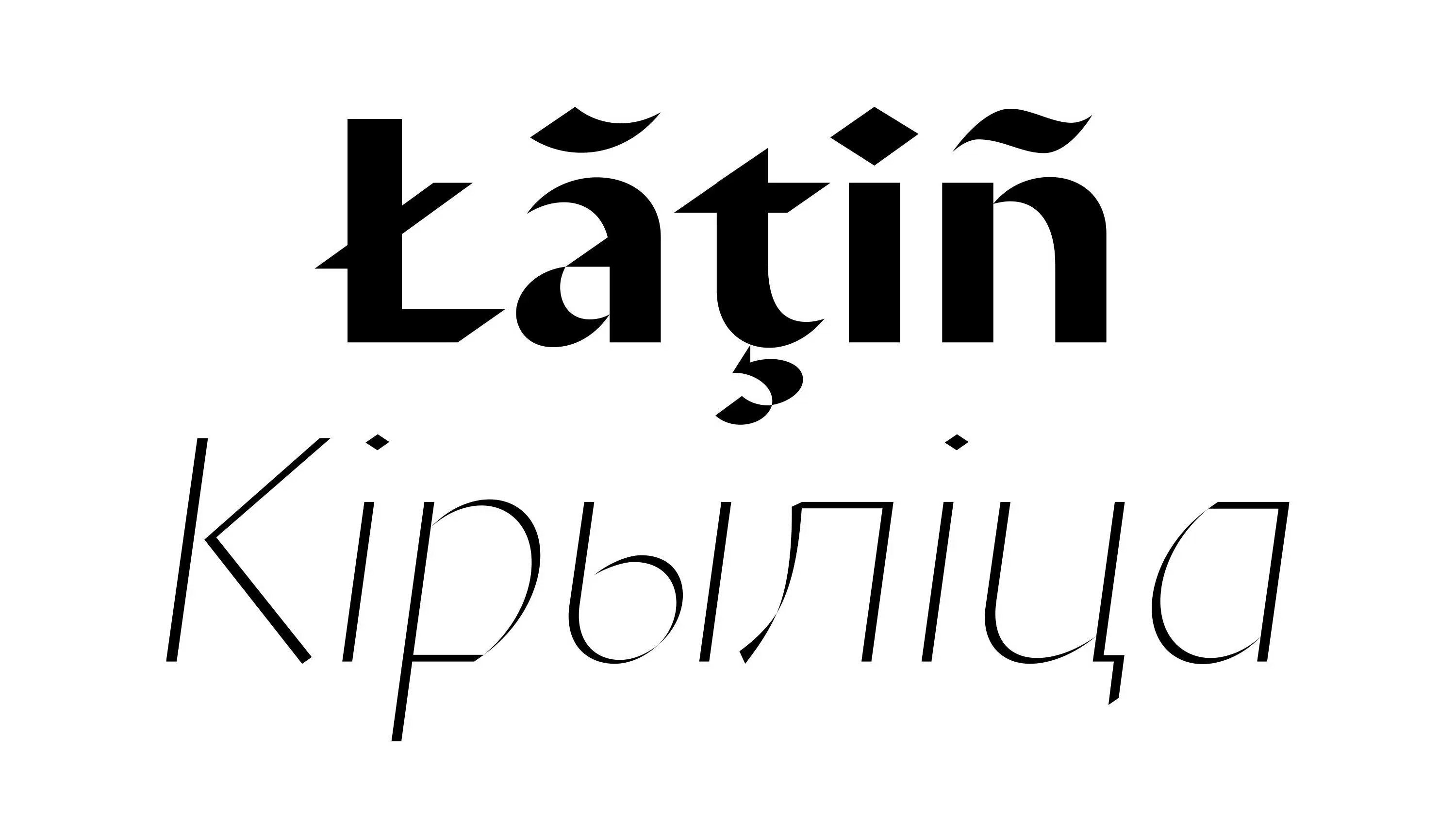
Scripts
Latin, Cyrillic
Features
Oldstyle/Lining Figures
Designer
Denis Serebryakov
Release
Mar 6, 2019
Displace 2.0 is a display typeface that could be associated with several different categories — but above all, it is digital calligraphy. Its construction and form are based on the logic of broad-nib writing, not as imitation, but as an independent reinterpretation with a distinct character.
The typeface was originally released under the name Displace — from the English to displace, meaning "to shift." The shift was literal, expressed through a specific graphic gesture. The original version featured a single style and offered a free reconstruction of Roman monumental lettering, intentionally simplified and geometrized in some of its elements.
Now, as then, the forms of Displace 2.0 retain a humanist aesthetic, gentle contrast, and a characteristic instability created by a slight displacement from the structural axis. The typeface includes ten styles: five weights, each with both roman and italic.