Epos

Family
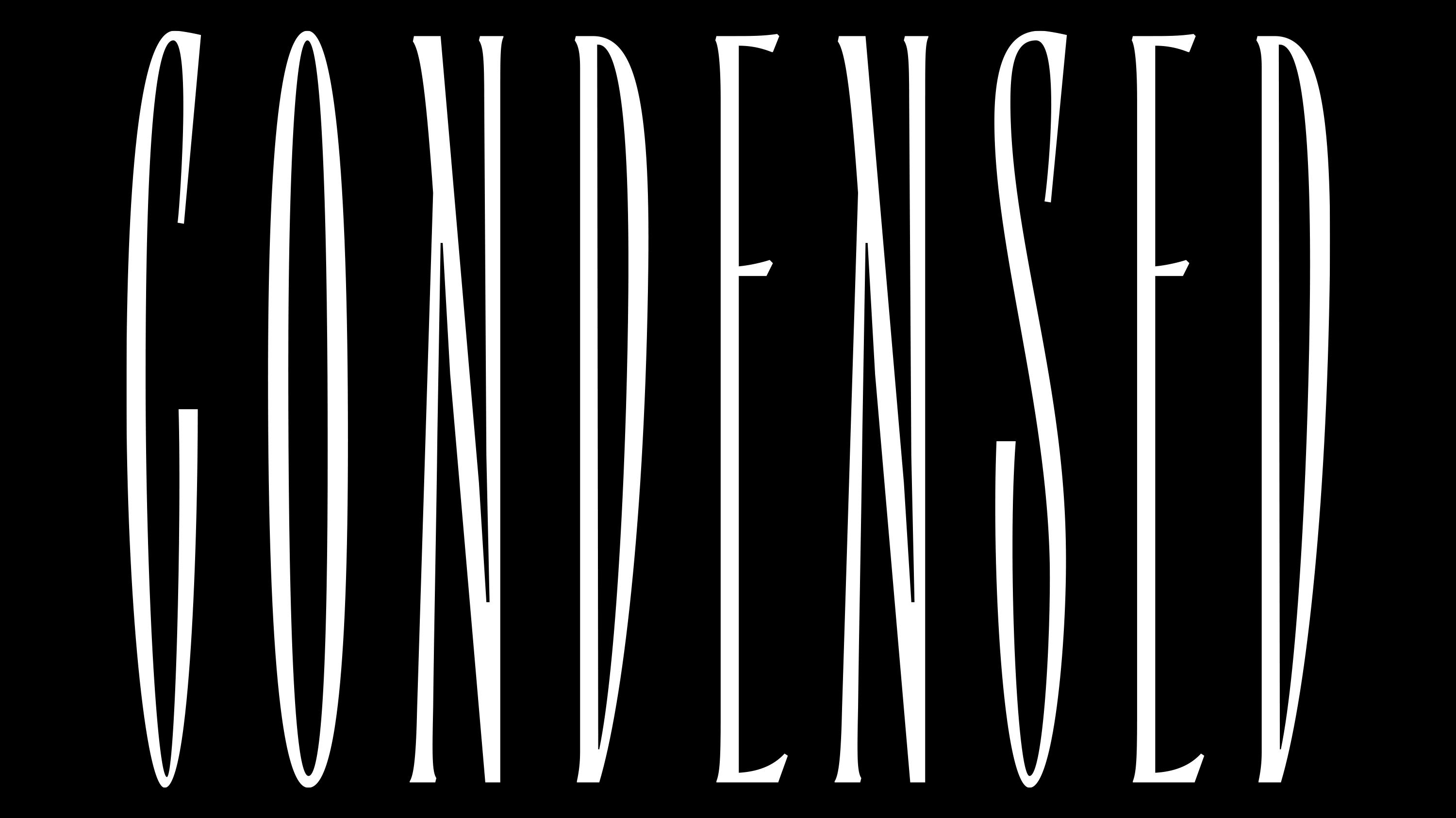
3 styles
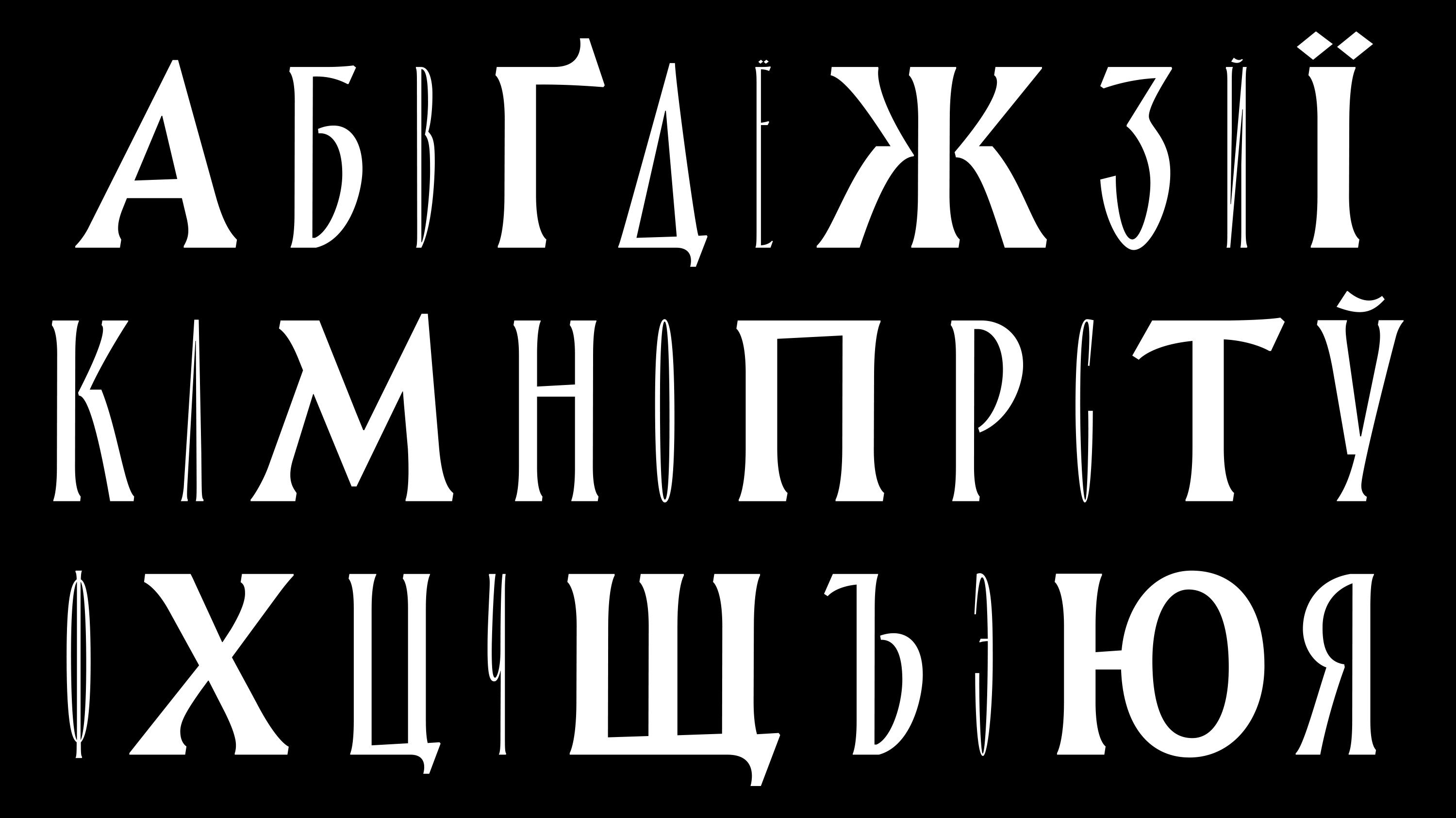
Scripts
Latin, Cyrillic
Features
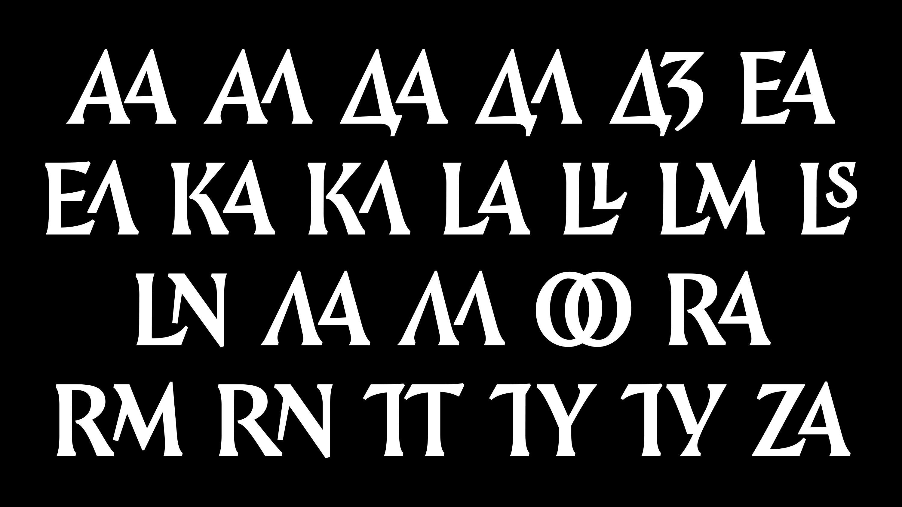
Discretionary ligatures
Stylistic alternates
Upper case forms only
Designer
Denis Serebryakov
Release
Aug 22, 2018
Awarded
2021, Modern Cyrillic, Winner
Epos is a theatrical figure in the typographic repertoire. It blends the grandeur of classical serif typography with its own mythology, creating an image where rhetorical tradition is reinterpreted as a narcissistic gesture.
The typeface was originally created for the project Mensk Legends — a visual myth of the city, where typography became part of the stage action. The scale and dramatic proportions of Epos reflect this performative tone. Its graphic language echoes the hand-drawn book covers of the 1920s to 1950s. It’s a serif with classical roots — but without academic discipline. It doesn’t reproduce the past, it declaims it.
Epos is an all-caps typeface available in three widths: ultra-condensed, medium, and regular. A wide set of ligatures and alternate characters allows for tighter, more rhythmic typesetting.