Founder
Family
10 styles
1 variable
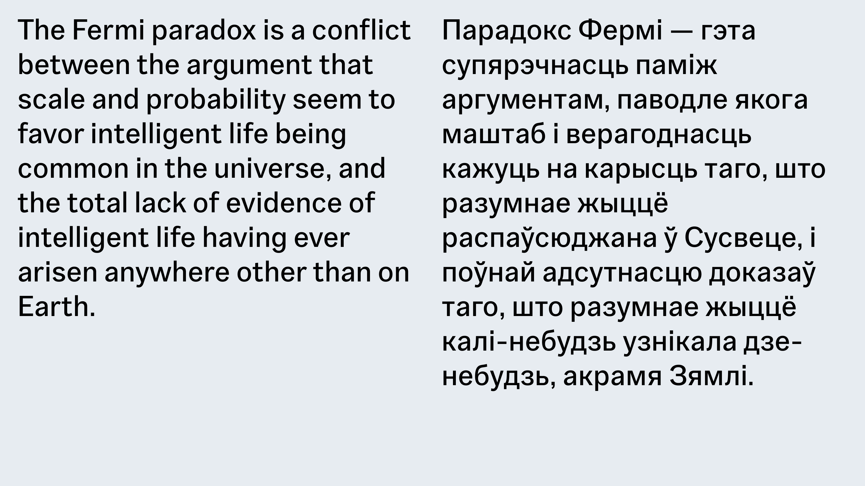
Scripts
Latin, Cyrillic
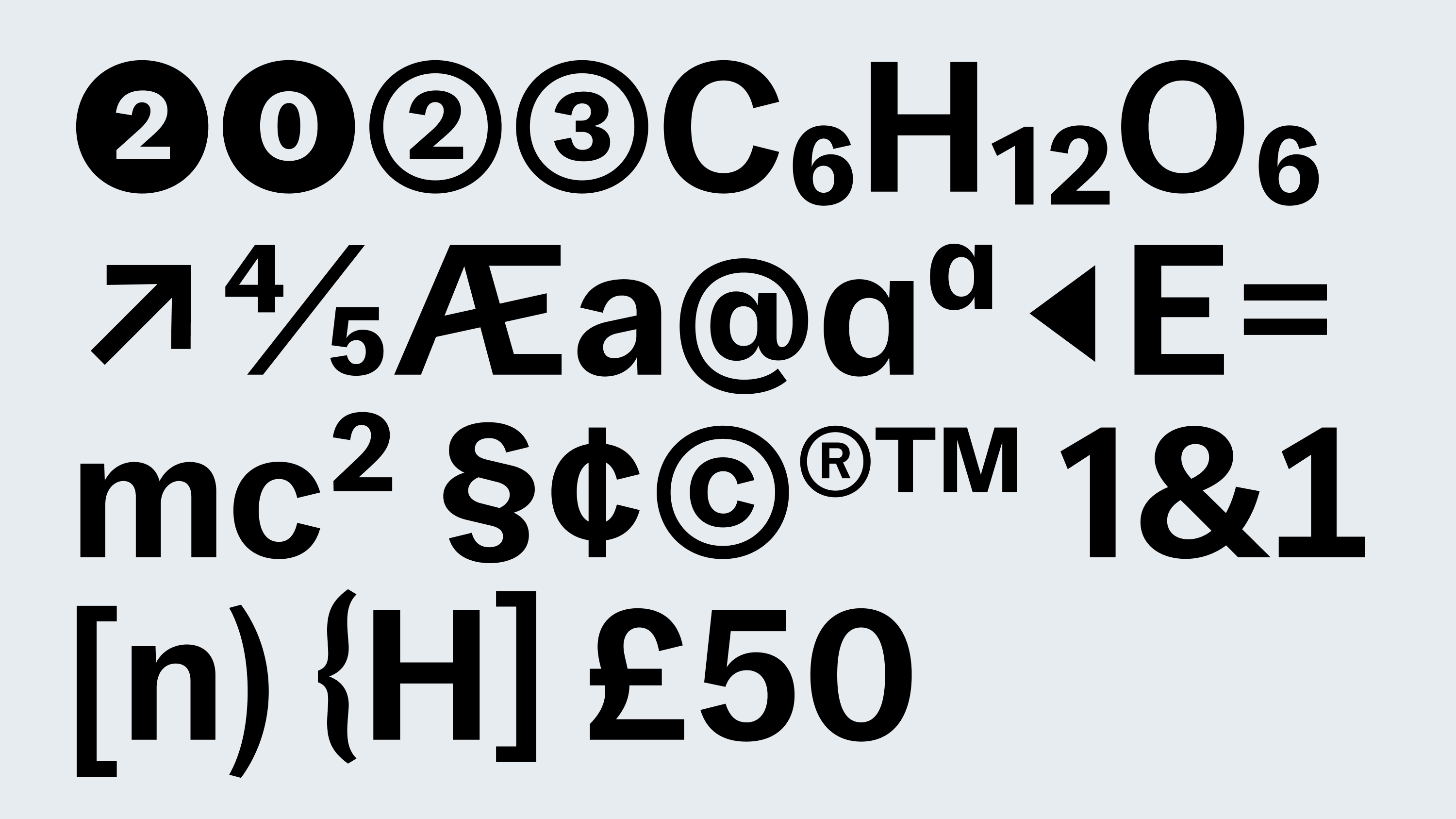
Features
Stylistic alternates
Case-sensitive forms
Designer
Denis Serebryakov
Release
Aug 1, 2023
Founder is a classic example of an early grotesque: restrained, natural, and subtly human. The family includes ten weights with varying degrees of saturation. It was originally conceived as a typeface that expresses nothing — yet doesn’t feel completely dry.
Behind its neutral appearance lies a soft tone and a slight sense of imperfection — a trace of human presence. Founderworks especially well where there’s a need to break the dominance of pragmatic neo-grotesques: be it a website, brand identity, or captions for illustrations.
It doesn’t impose visual solutions, but creates space for them — a universal tool ready to take on any context.