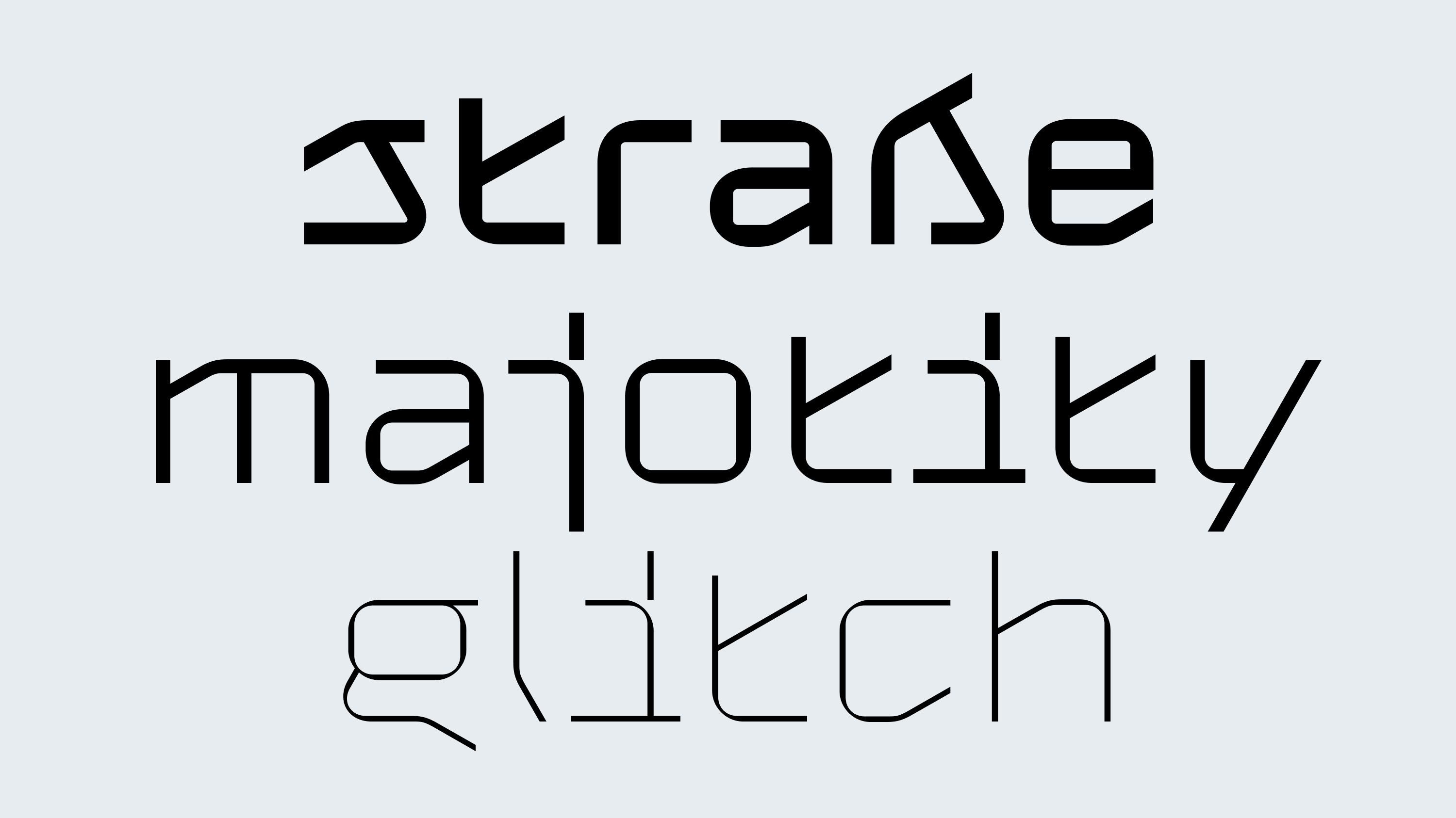
Gik

Family
3 styles
1 variable
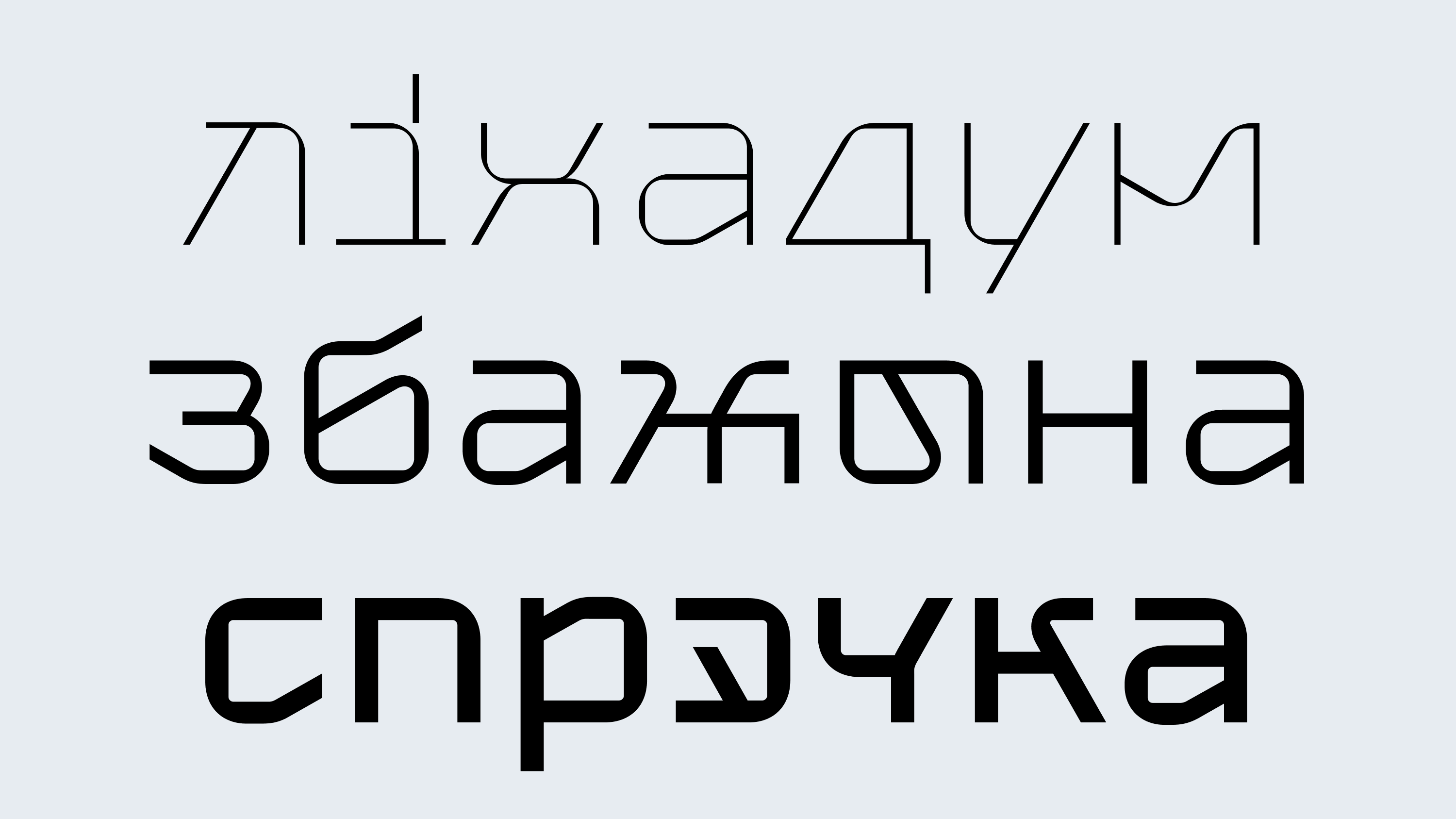
Scripts
Latin, Cyrillic
Features
Stylistic alternates
Case-sensitive forms
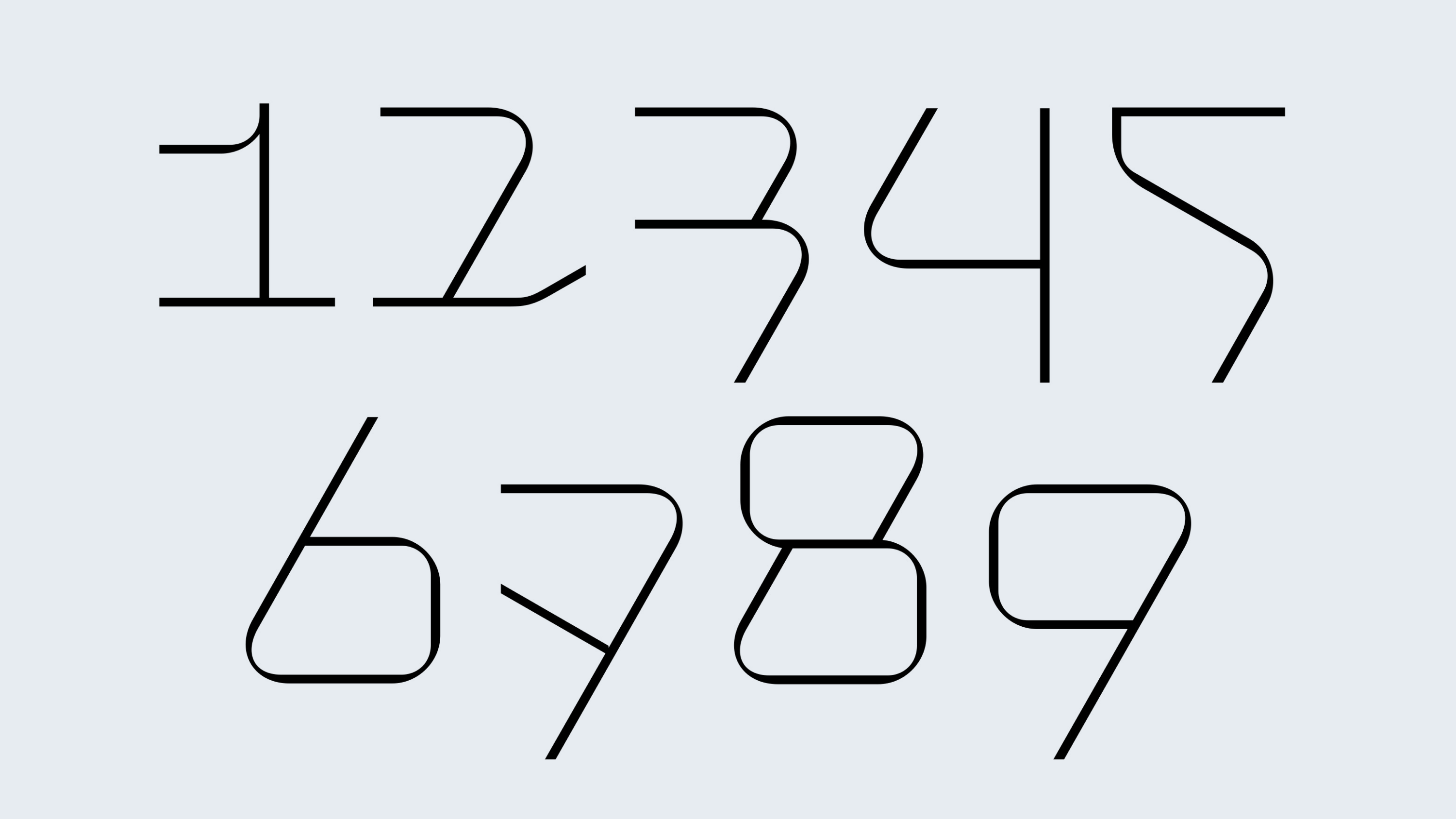
Oldstyle/Lining figures
Designer
Denis Serebryakov
Release
Oct 30, 2022
Awarded
13th Granshan Type Design Competition, Special Mention
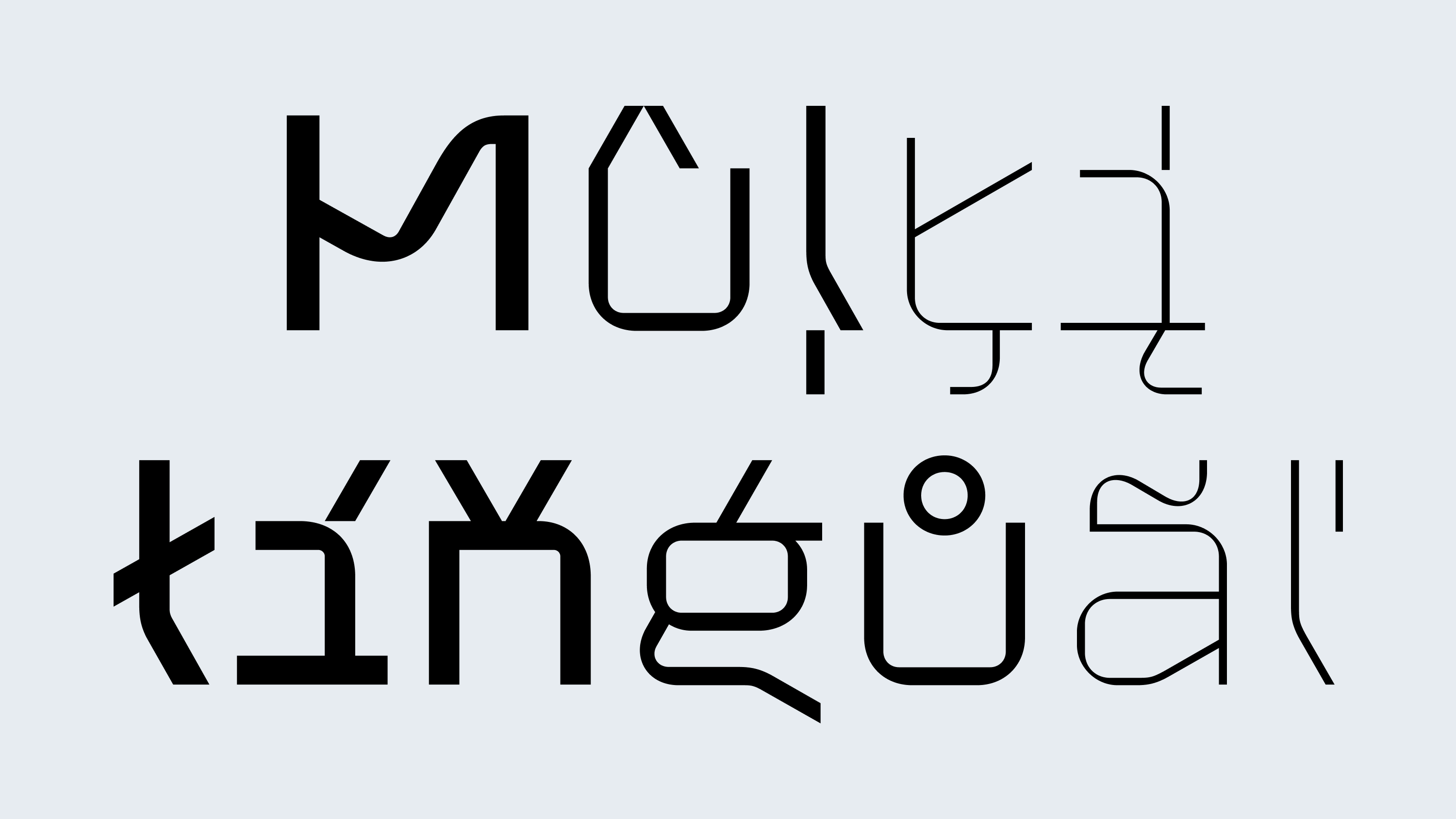
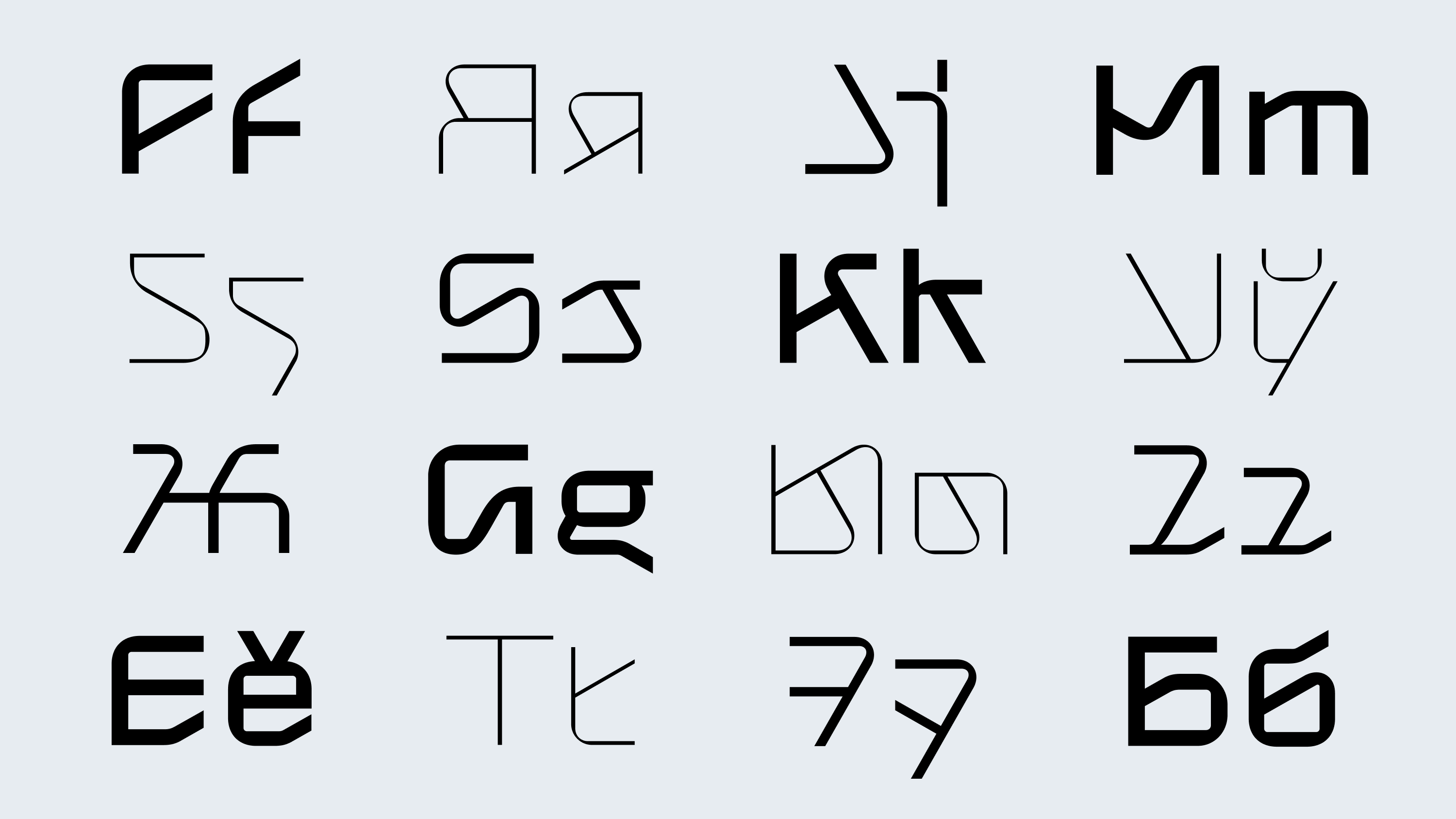
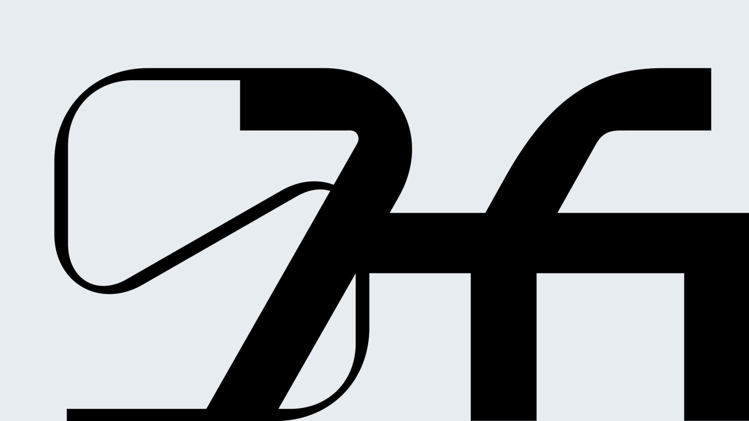
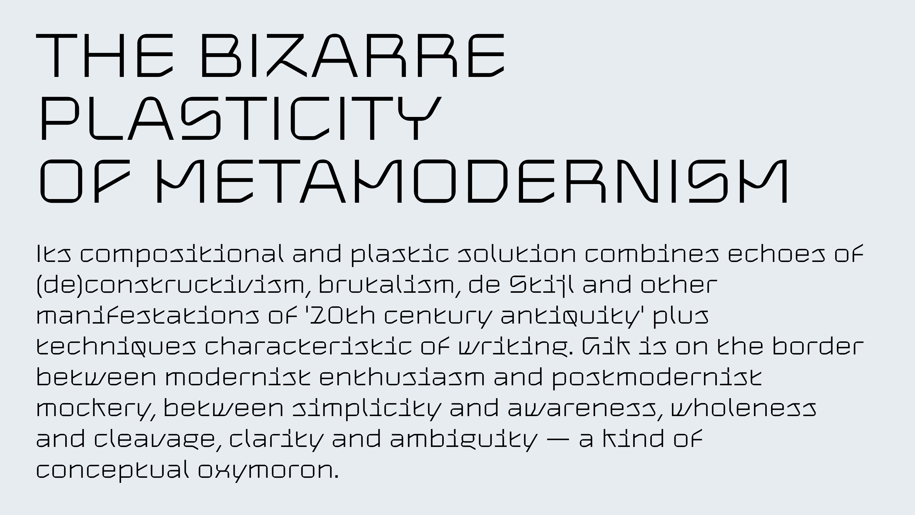
Gik is a modular sans-serif type family in three styles. Its compositional and plastic structure blends echoes of (de)constructivism, brutalism, De Stijl, and other manifestations of the “antiquity of the 20th century” with techniques characteristic of italics. This fusion doesn’t make the typeface feel outdated — on the contrary, it offers new clarity on how it can be used today.
Gik is a product of the metamodern era — suspended between modernist optimism and postmodern irony, between simplicity and self-awareness, unity and fragmentation, clarity and ambiguity — a conceptual oxymoron in typographic form.
Looking at Gik, one sees more than a typeface. It carries a message — to the designer and to the viewer. It provokes the imagination. It is an anthology of all typefaces of the future.