Nekst


Family
7 styles
1 variable
Scripts
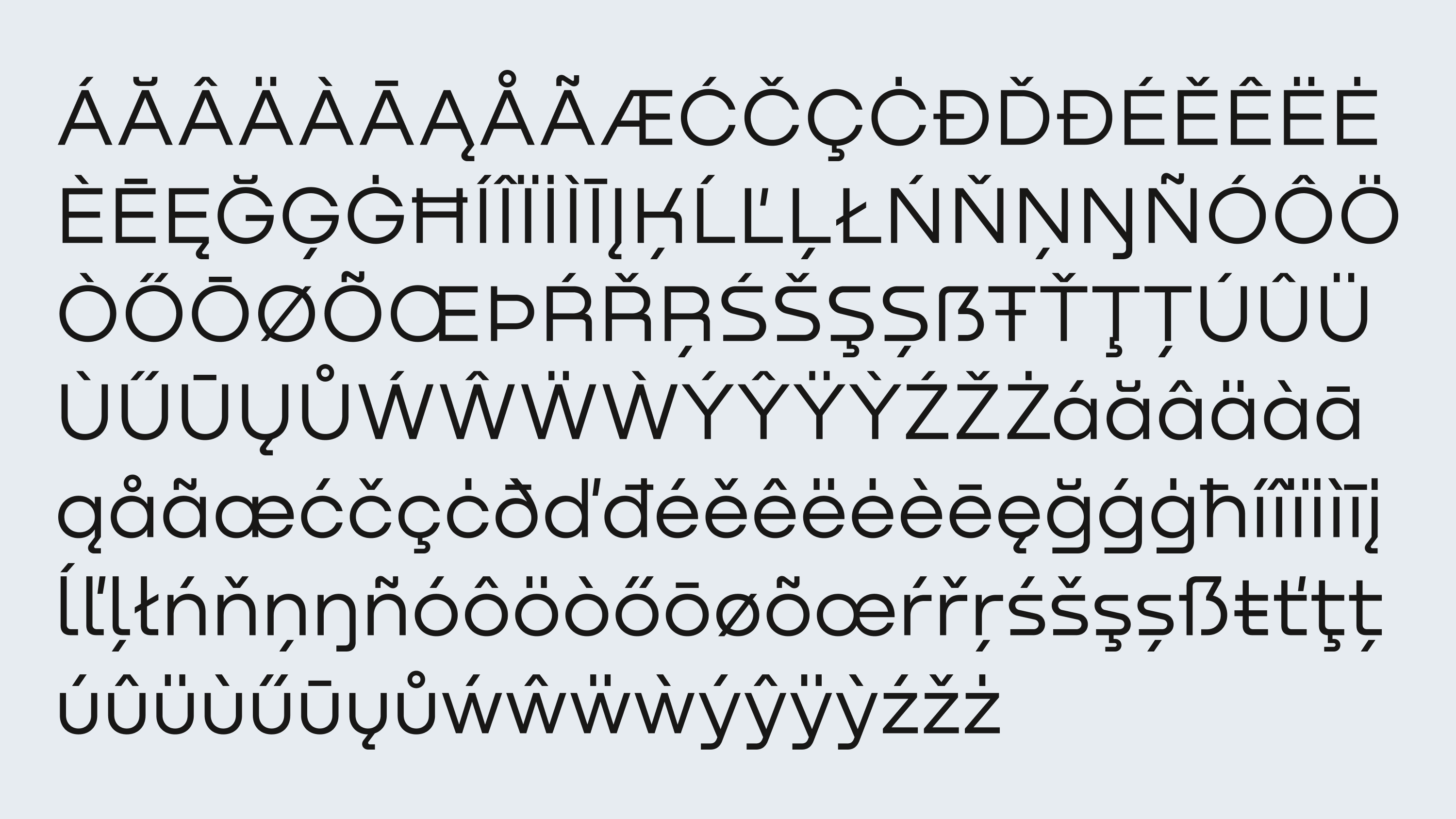
Latin, Cyrillic
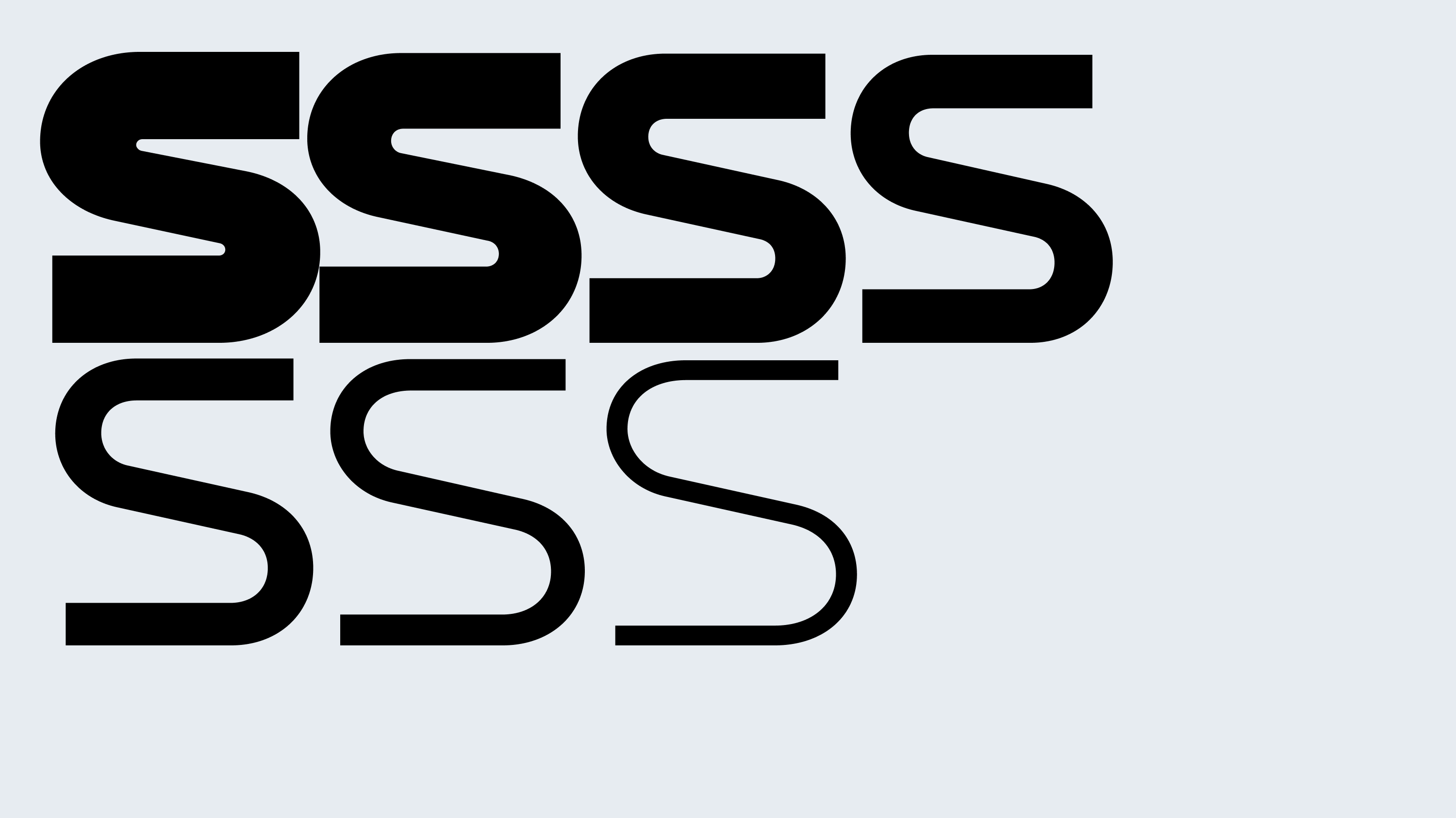
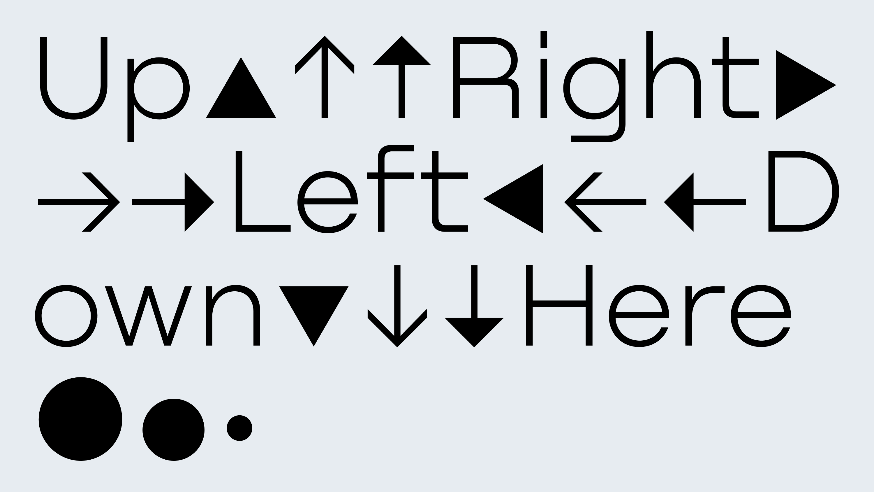
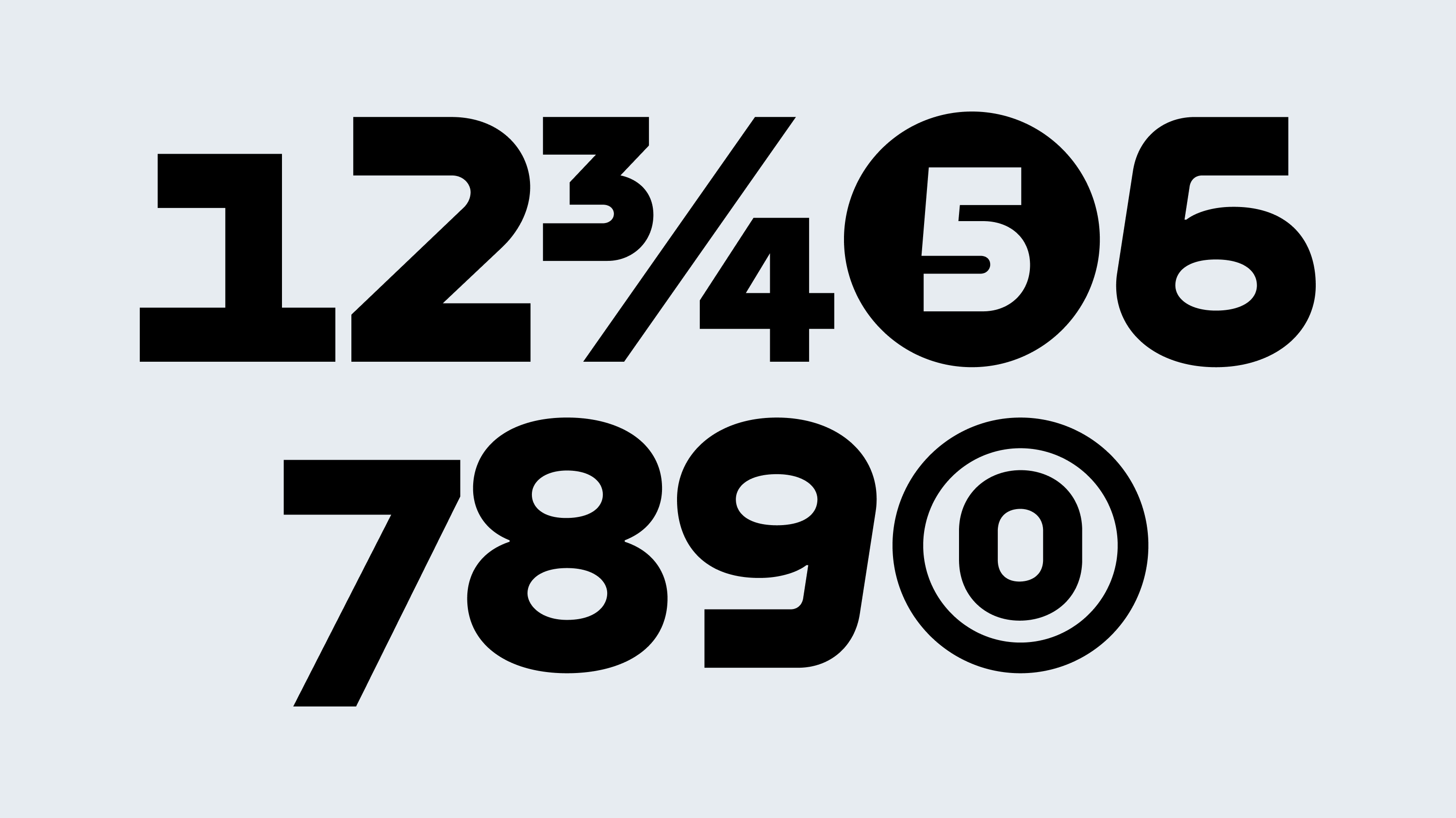
Features
Stylistic alternates
Case-sensitive forms
Oldstyle/Lining figures
Designer
Denis Serebryakov
Released
Jul 10, 2020
Awarded
2022, Granshan, Special Mention
Nekst is a geometric grotesque — simple and austere, but only at first glance. Beneath its apparent rigidity lies a quiet eccentricity. The typeface grew out of an idea to merge the aesthetics of early grotesques with the geometry of contemporary sans-serifs. In its forms, one can hear echoes of industrial typography, constructivist logic, and a touch of futuristic accent — all adding depth to its modern Nordic silhouette. Nekst is an authorial experiment: to combine what seems incompatible and preserve the sharpness.
With seven weights — from Thin to Black, Nekst adapts to a wide range of uses, from restrained to display. It feels equally at home in the identity of an industrial giant, on the interface of a tech startup, or within the fast-paced world of sports. Its relevance is not tied to context — Nekst is beyond time.
It blends contemporaneity and physical presence, determination and directness, structural force and typographic tension. This is a typeface where form doesn’t follow trend — it becomes a tool for visual thinking.