Startup
Family
9 styles
1 variable
Scripts
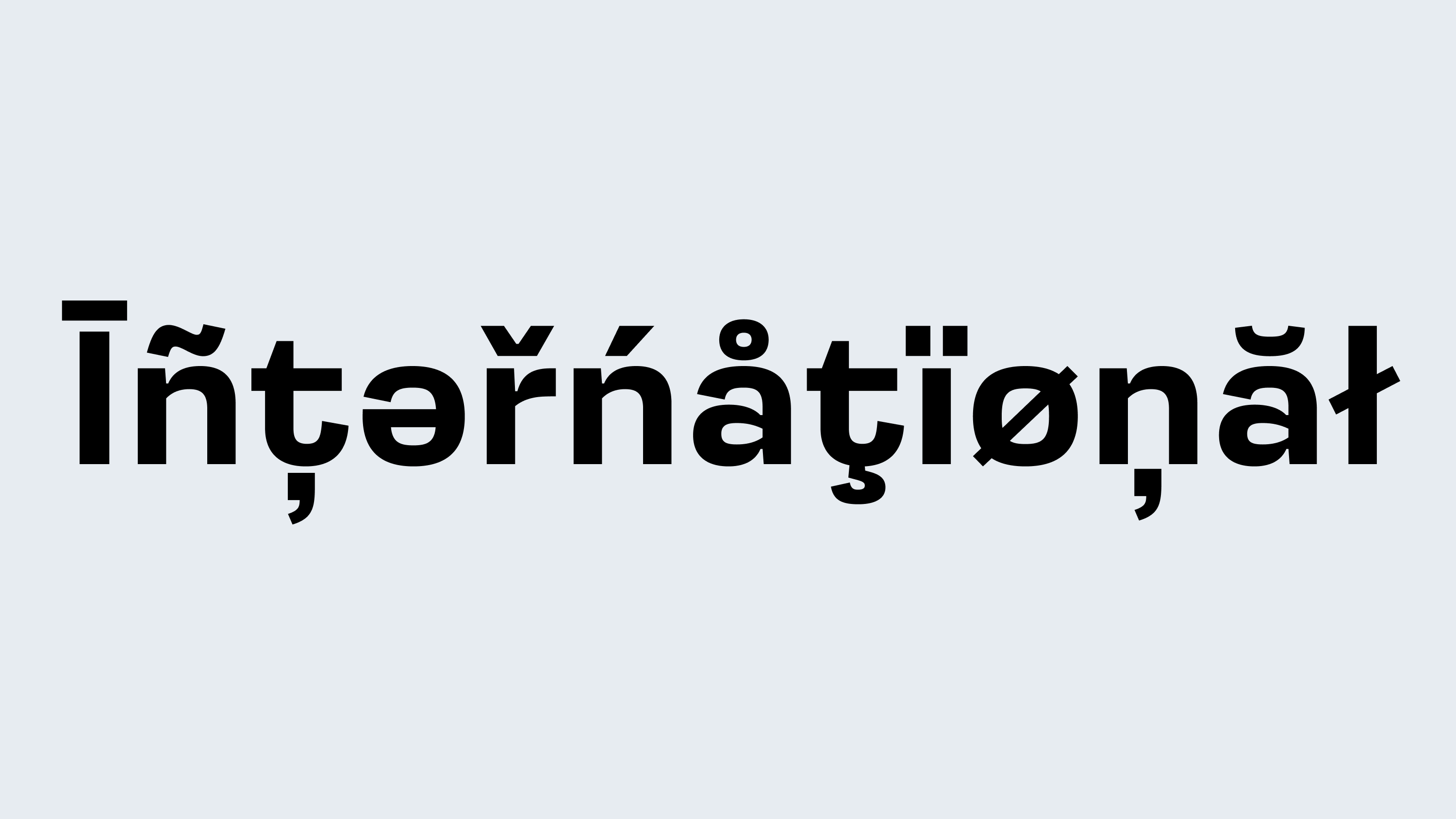
Latin, Cyrillic
Features
Stylistic alternates
Case-sensitive forms
Oldstyle/Lining figures
Designer
Denis Serebryakov
Release
Jun 7, 2022
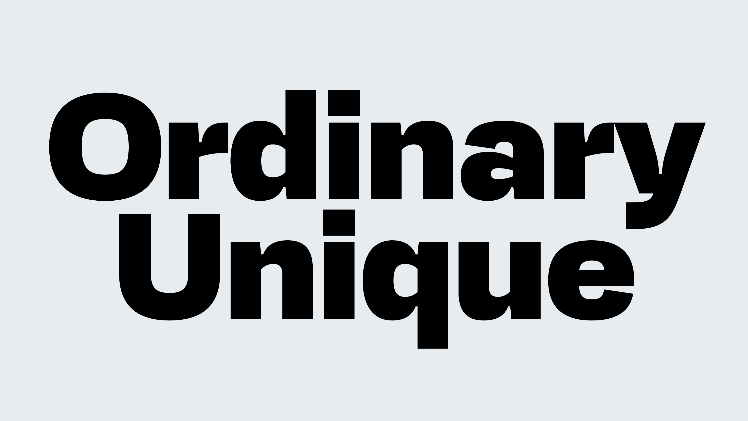
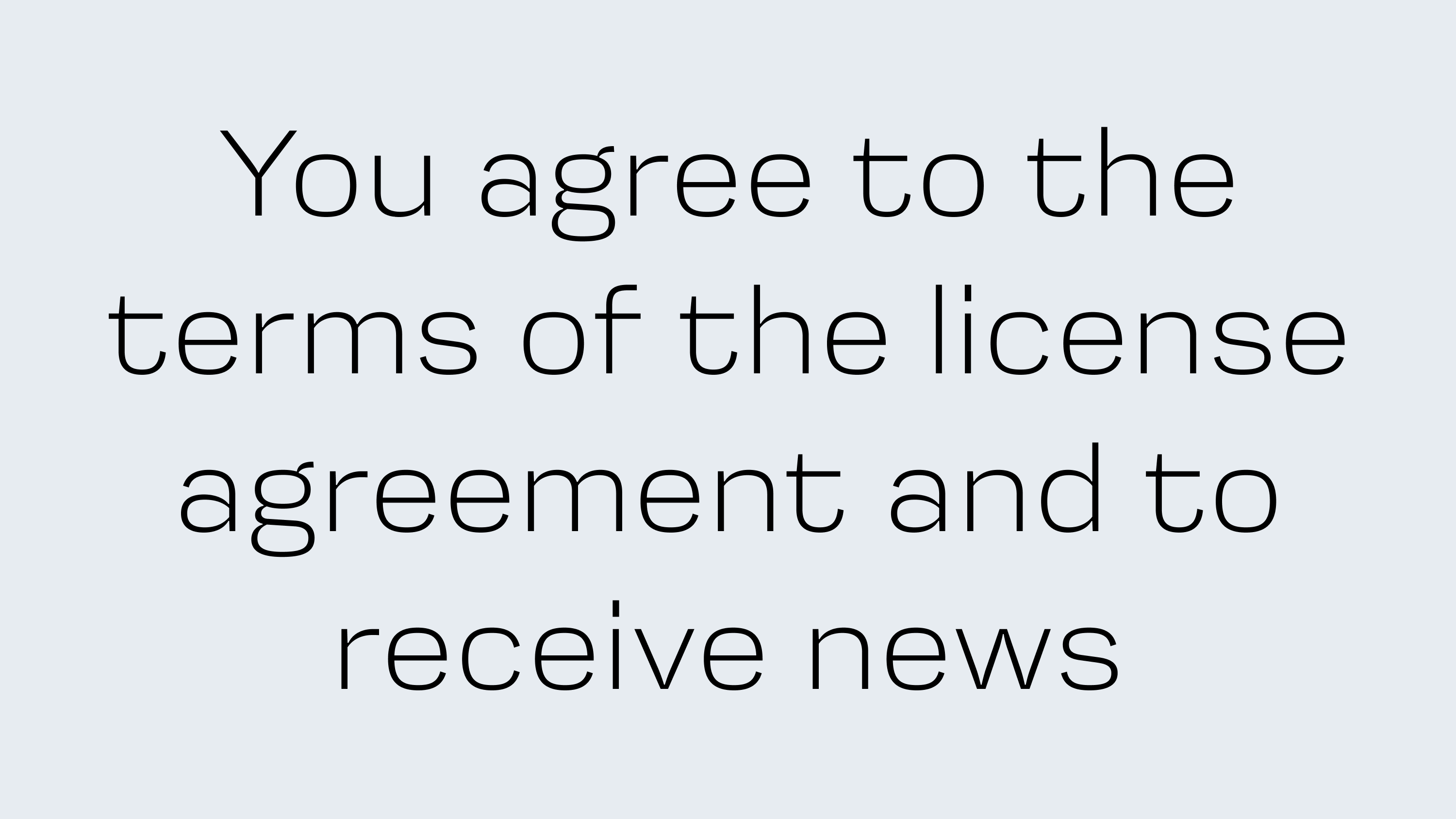
Startup blends features of neo-grotesques and early grotesque typefaces. With nine weights of varying intensity, it allows for clear typographic hierarchy within a single family. It’s neutral, but not faceless — it doesn’t draw attention to itself, yet it holds the tone. Its wide proportions make it particularly expressive in display use: logos, headlines, and highlighted text blocks.
This typeface will fit well into a project that needs to stay formal yet recognizable. It’s exactly the kind of challenge a designer often faces when developing a startup’s visual identity.