Taler

Family
7 styles
1 variable
Scripts
Latin, Cyrillic
Features
Stylistic alternates
Case-sensitive forms
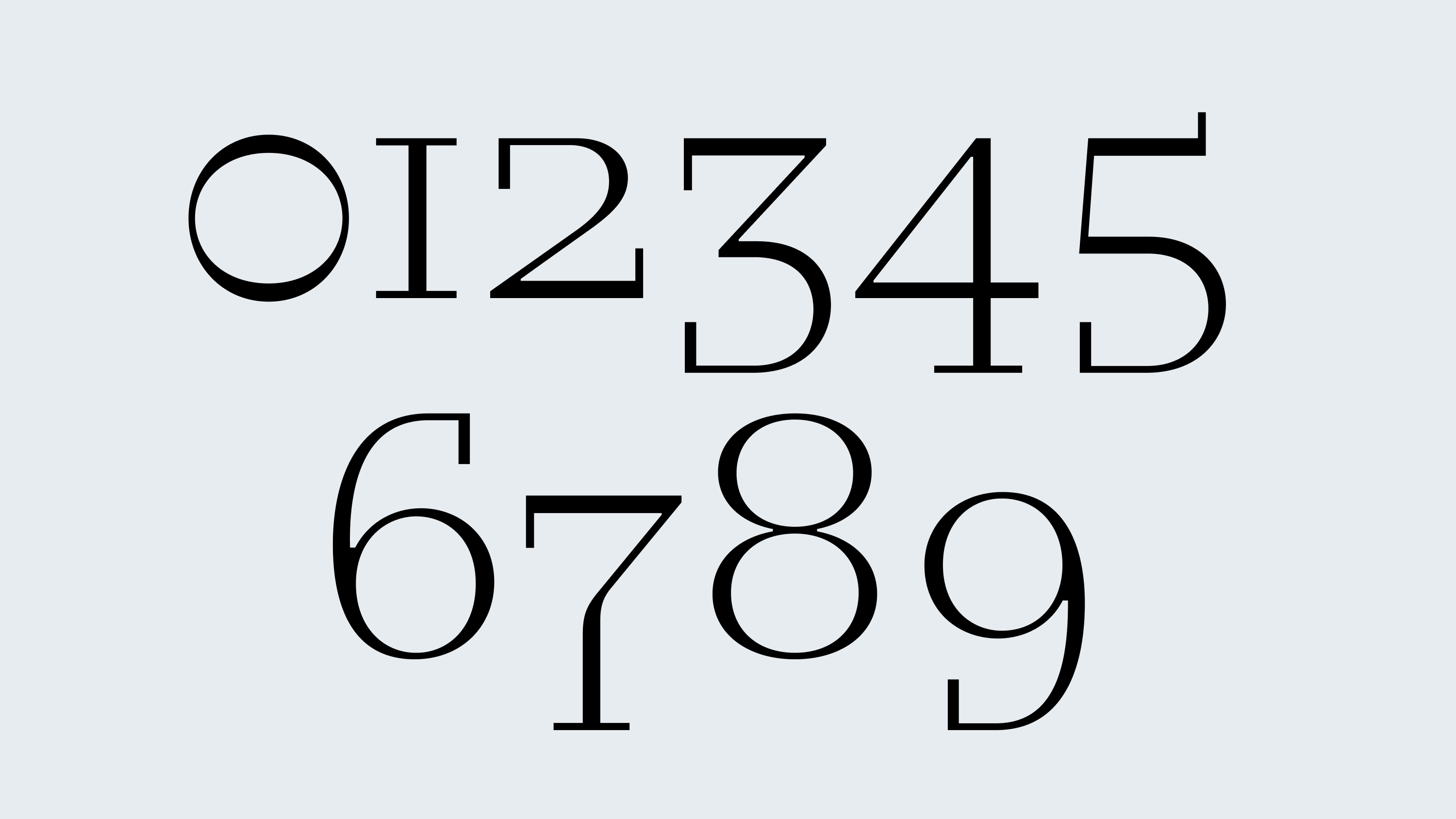
Oldstyle/Lining figures
Designer
Denis Serebryakov
Release
Sept 20, 2021
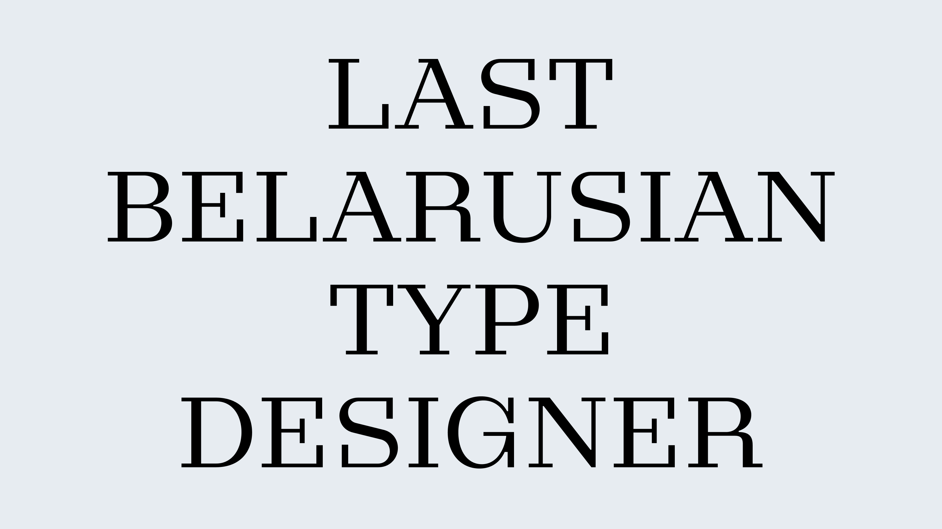
Taler began as a serif version of Nekst, but after the first drafts it became clear: this is a typeface in its own right. It retained the rigid construction logic, straightforwardness, and confident structure, but gained a distinct plastic freedom, expressed in its details. The rectangular, slightly elongated serifs define it as a slab serif, while the proportions and rhythm subtly echo baroque typefaces.
Taler is an elegant typographic specimen: restrained, yet capricious. Its caprice feels like a narcissistic deviation from the structural discipline typical of its genre. The family includes seven weights, allowing for a wide range of tone — from calm to nearly aggressive. In any case, Taler remains true to itself.
At small sizes, it reads as a confident serif with character. At large sizes, it reveals another personality: tense joins, atypical constructions, and choices made for expression rather than necessity.
Taler and Nekst differ in genre but are conceptually close. Used together, they form a typographic pair that amplifies each other’s contrasts.